Saint Peter’s Peacocks Logo
- Download PNG Saint Peter’s Peacocks Logo PNG Over 15 athletic teams representing Saint Peter’s University in Jersey City, New Jersey, play as Saint Peter’s Peacocks and Peahens.
- Meaning and history 1967 – 2002 Since 1967, the Saint Peter’s Peacocks logo has been updated three times, and yet, it has been consistent in its visual core.
- The 1967 logo featured an anthropomorphized peacock standing in full height.
- The logo was dominated by the tail.
- It did not look like a tail but rather like a blue patch with white dots.
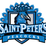
- 2003 – Today In 2003, the teams introduced an emblem featuring only the peacock’s head with the tail on the background.
- The name of the team in large letters could be seen in the forefront.
- Saint Peter’s Peacocks Colors NAVY PANTONE: PMS 541 C HEX COLOR: #003C71; RGB: (0, 60, 113) CMYK: (100, 41, 5, 36) BLUE PANTONE: PMS 285 C HEX COLOR: #0072CE; RGB: (0, 114, 206) CMYK: (99, 22, 0, 1) GRAY PANTONE: PMS WARM GRAY 6 C HEX COLOR: #A59C94; RGB: (165, 156, 148) CMYK: (11, 15, 18, 32) BLACK PANTONE: PMS BLACK 6 C HEX COLOR: #000000; RGB: (0,0,0) CMYK: (0,0,0,100) WHITE PANTONE: P 1-1 C HEX COLOR: #FFFFFF; RGB: (255, 255, 255) CMYK: (0, 0, 0, 0)


Leave a Review