Dijon logo and symbol, meaning, history, PNG
- Download PNG Dijon Logo PNG Dijon, also known as Dijon Football Cote d’Or, is a relatively young French football club, which was established in 1998.
- Based in Dijon, the club was created through a merger of two regional teams.
- Meaning and history Though the club was established at the end of the 1990s it has already had three official logo designs by today.
- An owl is the symbol of Dijon and the most famous detail of the local Notre-Dame.
- Though the image looked more funny than serious.
- 2006 — 2014 The redesign of 2006 brought a completely new style to the club’s visual identity.
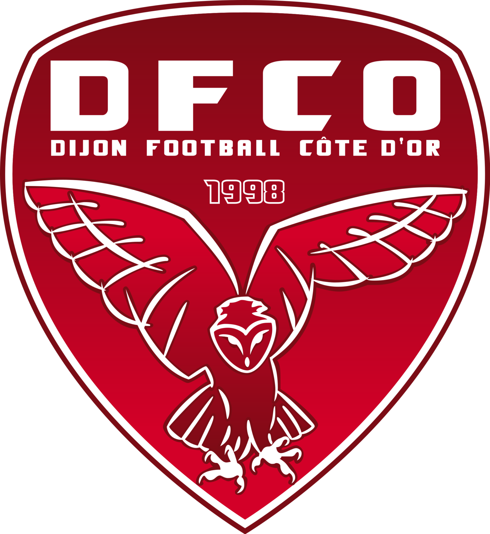
- The badge was now super modern and strong — a sleek smooth red crest in gradient shades featured a double white and red outline and a stylized image of a flying owl with its wings spread up and to the sides.
- The custom bold lettering in white was placed on the upper part of the badge, with “DFCO” enlarged and “Dijon Football Cote D’Or” placed under it in small capitals.
- The “1998”, a year of the club’s establishment, was placed between the owl and the wordmark, contoured in white and balancing the bird’s image.
- 2014 — Today In 2014 the logo was redesigned again.
- Though now it is fully based on the previous version, it still looks different.
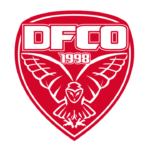
- The same red shield in a white outline, but the gradient shade is gone, so the whole image became flat and more modern.
- As for the wordmark, it was also simplified — the long tagline is now gone, so the only symbols were can see on the club’s shield are “DFCO” in a custom and sharp sans-serif, and bold “1998” in a double white and red outline.
- It is a great representation of the team, which is instantly recognizable and looks good on any color of the uniform.





Leave a Review