N64 logo and symbol, meaning, history, PNG
- 1995 – 1996 The original version of the N64 logo, which was used during the ore launch of the product, featured a solid black square with the narrowed white “Nintendo” in Sans-serif on top, an enlarged gradient purple “Ultra” in the middle, and the outlines “64”, surrounded by a white orbit, placed under the “Ultra” wordmark.
- 1996 – 2002 The redesign of 1996 completely changed the N64 visual identity, making it composed of two parts — a bold blue lettering and a stylish multicolor emblem, placed under it.
- The “Nintendo” inscription in all capitals was written in a square Sans-serif typeface and had a red “64” placed on its right, and executed in thinner lines.
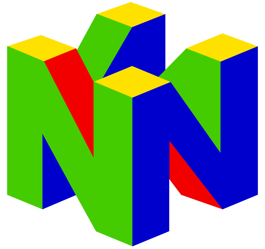
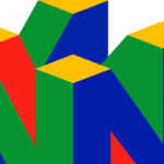
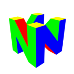
- The emblem of the brand featured a three-dimensional figure, formed by four merged letters “N”, making up a cube.
- The color palette of the image boasted a bright and strong combination of green, red, yellow, and blue, each color for one of the cube’s sides.
- The figure “64” that is a part of the wordmark reminds of the fact that the console got its name after its 64-bit central processing unit.
- Emblem The most interesting fact concerning the Nintendo 64 logo is that it has 64 faces and 64 vertices if rendered as a 3D model.
- If you try counting on your own, you may come to the conclusion that the numbers of the faces and vertices are different.
- That is because the Nintendo designers counted not only the blocks that are visible, but also the hidden ones.
- Font As far as the Nintendo 64 logo is built around a single letter, we should point out its typographic qualities.
- The capital “N” belongs to a clear sans-serif typeface looking somewhat stocky and solid.
- Color The basic logo comprises four colors: red, green, blue, and yellow.
- As the result of this, the N64 logo leaves a vivid visual impression.
- Interestingly enough, these colors coincide with the colors of the buttons on the Nintendo 64 console (four yellow buttons, one red, one green, and one blue).





Leave a Review