UNICEF logo and symbol, meaning, history, PNG
- Meaning and history The United Nations Children’s Fund appeared in 1946 with the mission of protecting European children who suffered from the devastation of World War II.
- While the inner part of the monochrome emblem was executed in thin fine lines, the framing featured bold elements and thick touches.
- The lettering in the uppercase was executed in a simple medium-weight sans-serif font.
- The “UNICEF” logotype was arched under the badge, in thick lines and with lots of space between the capital letters.
- 1960 – 1975 In 1960 the logo was redesigned against the lettering from the top part of the logo was removed, and the bottom line “United” inscription switched its typeface to a bolder and more modern sans-serif, with rounded elements and straight cuts of the letter lines.
- As for the graphical part, the lines were modified and the black kid’s silhouette was replaced by the black image of a woman holding a baby in his hands.
- The stylized sans-serif inscription executed in extra-thick lines was set in black on a white background and had the dot above the letter “I” replaced with the iconic globe emblem with the mother and the child.
- It was a contemporary and bold logo, which evoked a sense of protection and stability.
- 1978 – 1986 The redesign of 1978 added lightness to the logo by complementing each black letter of the inscription with a thin white line coming through the middle and repeating the shape of each symbol.
- 1986 – 2001 In 1986 the UNICEF logo was redesigned again.
- Now the emblem was set on the right from the logotype, which was set in the lowercase of a simple and strict sans-serif typeface, using medium-weight lines.
- The clean contours of the letters and pretty much space in the inscription made the whole composition look stable yet airy and friendly.
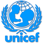
- 2001 – Today The UNICEF logo comprises the image of a mother and child, a globe, olive branches, as well as the wordmark.
- The depiction of a mother and child emphasizes the noble mission UNICEF undertakes, while the olive wreath can be interpreted in a number of ways.
- In Ancient Greece, it was the prize for the winner at the Olympic Games, so it can be a symbol of victory.
- As part of the UNICEF emblem, the olive branches are most often understood as the symbol of peace.
- The globe emblem The depiction of the Earth is a way to emphasize that UNICEF takes care about children all around the world and that borders do not exist for this organization.
- Some conspiracy theories connect this fact with the 33 steps of the ladder that a Freemason may climb, thus creating a link between UNICEF and Freemasonry.
- Font The name of the organization, which should have been given in capital letters, is lowercased.
- Color One of the features of the UNICEF logo that is often misinterpreted is its color scheme.






Leave a Review