Tottenham Hotspur logo and symbol, meaning, history, PNG
- Download PNG Tottenham Hotspur Logo PNG One of the oldest football clubs in England, Tottenham Hotspur has had not so many logos over the course of its 136-year-old history.
- Established in 1882, the club used various images of spurs as its logo, but the first official badge appeared only at the beginning of the 1920s, and this was when the bird was taken as the team’s symbol.
- The shield and its thick framing also haven’t changed.
- Now the cockerel was standing on a big blue football and the framing was removed.
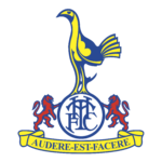
- 1983 — 1995 The logo, created in 1983 was one of the most ornate in the club’s history.
- Another significant detail of this version is a yellow ribbon with the club’s motto “Audere Est Facere”, which means “To Dare Is To Do”.
- The lettering was written in blue serif typeface with bold clean lines.
- The blue cockerel on the monogram in a circle was placed inside a crest in a wide blue outline again.
- This was a mix of several older logos and only stayed with Tottenham Hotspur for a couple of years.
- 1997 — 1999 The brightest and the most colorful Tottenham logo of all time was introduced in 1997.
- It was a Royal-blue crest in a thick yellow frame with many graphical symbols on it.
- The brown football was placed in the middle and a cockerel in white and blue was standing on it as usual.
- Under the shield the blue ribbon with the motto was placed, featuring yellow lettering and outline.
- 1999 — 2006 In 1999 the club comes back to their emblem from 1983.
- The composition and color palette is exactly the same, but the contours and lines were slightly modified and cleaned.
- This version stays with the club for another seven years.
- The blue cockerel with a white head is standing on a blue football with white stitched.
- Its capitalized letters are executed in a simple yet bold and modern sans-serif typeface, which looks strong and stylish.
- Font and color The elegant yet modern arched inscription on the Tottenham Hotspur emblem is written in all capitals of a custom typeface, with slightly visible sharp serifs on thick straight lines.
- The color palette of the Hotspur visual identity is based on a royal-blue shade with white accents.


Leave a Review