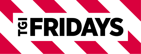
TGI Fridays logo and symbol, meaning, history, PNG
- Meaning and history 1965 The first TGI Fridays location was opened in 1965 in New York.
- The original TGI Fridays logo contained by far more details than the current one.
- To begin with, the type was a pretty elaborate one, with lots of tiny decorative details.
- There was even a purely decorative element reminding a curly bracket below the word “Friday’s.” The lettering was housed inside an intricate shape with its border made up of red and white stripes.
- Some locations used different logos.
- For instance, the lettering “Friday’s” with a striped bar below.
- 2004 The design was somewhat simplified.
- The type was replaced by a more utilitarian (although still playful and casual) sans.
- The red grew darker, while the border of the logo grew wider.
- 2013 The emblem was updated by Jane MacDowall and her creative team based in Scotland.
- The design made one more step towards simplicity and minimalism.
- To begin with, the logo now had a clean rectangular shape.
- The type lost the playful style of its predecessor – it was now a generic, rather bold sans.
- Video


Leave a Review