Sevilla logo and symbol, meaning, history, PNG
- Though the style and color palette hasn’t changed much since the 1920s, the confidence and execution of the iconic badge have made a huge step forward throughout the years: 1908 — 1909 Though the very first badge of Sevilla football club was very naive and amateurish, it still became a base for the iconic badge the whole world knows today.
- The first one was a red and white hand-drawn football with vertical stripes and a black “Sevilla Football Club” gothic lettering on it.
- The second part of the visual identity featured a red “SFC” monogram enclosed in a rounded frame.
- 1909 — 1915 In 1905 the monogram became black and white and the framing was now composed of a double black outline, where the “Sevilla Football Club” inscription was placed around the perimeter.
- 1915 — 1918 The logo was modified in 1915, keeping the original composition, but executed in a more professional and confident manner, adding the “1905” part to the wordmark around the monogram’s perimeter.
- 1918 — 1921 The red and white logo from the 1900s came back to the club’s official visual identity, being redrawn in bolder and cleaner lines.
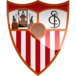
- The crest, featuring a vertical white and red striped pattern, had two white fragments on its upper part — on the left, there was a colorful image, showing the Trinity, which is the symbol of the Seville City, and in the right, there was a red club’s monogram placed.
- 1926 — 1932 The color palette was modified, as well as the contours of the whole logo.
- The black flower on a yellow circle turned into a brown football with black stitches.
- The Trinity and the monogram have also been redrawn in a more professional way, with stronger lines and contours.
- Football changed its color scheme from brown and black to yellow and black.
- 1945 — 1966 In 1945 the upper part of the crest is being colored in red and yellow, making the whole logo look stronger and more professional.
- 1966 — 1979 The crest is being modified again in 1966.
- The monogram gains thinner and more elegant lines, with the letter “S” elongated.
- 1979 — 1995 In 1979 the color palette of the Trinity part of the crest gains several new shades — burgundy and brown, which makes the image more detailed and interesting.
- Another change has been done to the iconic monogram, now it looks even more elegant and sophisticated than on the previous versions.
- 1995 — Today The logo we all know today was created in 1995 and remains unchanged for more than 20 years by now.
- Enclosed in a circular frame, it is a celebration of the very first Sevilla badge, showing the club’s value of its roots and heritage.
- The “S” and “C” of the monogram have their rounded contours extended and sleek, while the strict geometric “F” is narrowed and looks like the axis for two elegant symbols.
- The red, gold, and white color palette of the Sevilla FC visual identity is a representation of a strong link to the roots and legacy of the football club, along with its passion and power, willingness to progress and win.





Leave a Review