Seattle Seahawks logo and symbol, meaning, history, PNG
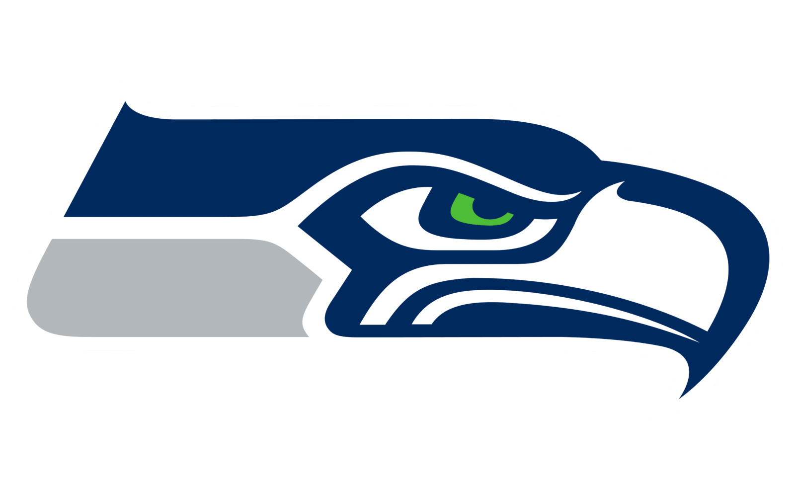
- Download PNG Seattle Seahawks Logo PNG The Seattle Seahawks logo is the sort of emblem that creates a strong emotional response.
- The aggressive, indigenous bird, whose fierce glare is not that easy to forget, has been only modified twice.
- Back then, the team’s General Manager John Thompson described a Seahawk in the following way: a “tough, fish-eating bird.” The logo featured a picturesque blue and green osprey’s head with a strong beak.
- 2002 — 2011 At first glance, the logo was almost the same, as the core visual metaphor was not changed.
- However, in fact quite a few modifications took place, resulting in a cleaner, more aggressive and stylish look.
- Starting from 2012, it included the so-called College Navy and Action Green shades, as well as the Wolf Grey accent color.
- The origin of the logo John Thompson, who was hired as the team’s general manager in 1975, mentioned that when the NFL firm was commissioned to design the logo, he asked them to “follow the Northwest Indian culture”.
- This fact was even explored in a 1975 article in Seattle PI.
- It was a so-called transformation mask existing in the two forms: when closed, it showed an eagle, while when it opened during the dance, it revealed a human face.
- The similarity with the Seahawks logo was absolutely obvious: one cannot but notice the bold line around the eye and the mouth, the distinctive eyelid lines, as well as the overall shape of the head and beak.
- Most likely, the mask was made somewhere between Alaska and Seattle.
- Where is the mask now?
- Shortly after the origin of the Seahawks emblem was rediscovered, the mask itself was found, too.
- It turned out to be part of the Hudson Museum at the University of Maine.
- To make the mask closer to the Seahawks fans, it was brought from Maine to Seattle.
- At the end of the 3,200 mile journey, the mask arrived to the Burke museum, where it has been on display more than once.
- Font The current Seahawks wordmark features a solid all-cap typeface.
- The type is perfectly legible, yet recognizable due to the distinctive sharp elements present on all the letters.
- Color The color palette includes the shade of blue that is called “College Navy” (or ”Seahawk Blue”), as well as “Action Green” and “Wolf Grey.” All the three are the team’s official colors, also present in their uniform.
- Seattle Seahawks Colors COLLEGE NAVY PANTONE: PMS 289 C HEX COLOR: #002244; RGB: (0, 34, 68) CMYK: (100, 65, 0, 60) ACTION GREEN PANTONE: PMS 368 C HEX COLOR: #69BE28; RGB: (105, 190, 40) CMYK: (57, 0, 84, 0) WOLF GRAY PANTONE: PMS 429 C HEX COLOR: #A5ACAF; RGB: (165, 172, 175) CMYK: (5, 0, 0, 30)





Leave a Review