San Francisco Dons Logo
- Download PNG San Francisco Dons Logo PNG The 17 athletic teams representing the University of San Francisco compete in 11 sports, including football, baseball, and basketball.
- Meaning and history 1982 If you want to see a perfect example of a cluttered design, take a look at the San Francisco Dons logo used between 1982 and 2000.
- The emblem could be divided into two parts.
- On the top, there was the lettering “USF DONS” given in two lines.
- The “O” was wearing a mafia boss mask.
- Below, the skyline of San Francisco could be seen, and there was the Golden Gate Bridge on the forefront.
- The problem was that the abundance of details did not let you grab the image as a whole.
- Also, the letters overlapped with the picture, which also created the illusion of visual noise.
- 2001 The following emblem (2001-2011) was by far cleaner.
- There were the letters “USF” with a saber going through the “S.” 2012 – Today The current version of the San Francisco Dons logo was adopted in 2012.
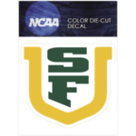
- Here, you can see a large “U” with the letters “S” and “F” inside it.
- The “U” is golden – the color that has probably been inspired by the Golden State.
- The other two glyphs are dark green.
- San Francisco Dons Colors USF YELLOW PANTONE: PMS 1235 C HEX COLOR: #FDBB30; RGB: (253,187,48) CMYK: (0,25,100,0) USF GREEN PANTONE: PMS 554 C HEX COLOR: #00543C; RGB: (0,84,60) CMYK: (95,0,80,60) USF GRAY PANTONE: PMS COOL GRAY 9 HEX COLOR: #919194; RGB: (145,145,148) CMYK: (0,0,0,55)










Leave a Review