Sacramento Kings logo and symbol, meaning, history, PNG
- Meaning and history The visual identity history of the Sacramento Kings basketball club is linked to numerous relocations of the team throughout the years.
- It was established as Rochester Royals, then moved to Cincinnati, 1972 the club started to play in Kansas, and, finally, in 1985 the Sacramento Kings appeared, and this is when the modern era of the logo designs starts.
- The blue “Royals” lettering was placed on the ribbon, while the “Rochester” was written above it, on a blue background.
- 1971 — 1972 The redesign of 1971 brought another shield to the Royals’ visual identity.
- This time it was a modern rounded structure in red, blue, and white, with the “Royals” inscription executed in extra-bold smooth Sans-serif and placed in a red background color and “Cincinnati” in blue capitals set above the crest.
- 1972 — 1975 After another relocation, the club gets a new name in 1972, and now it is Kansas City — Omaha Kings.
- The visual identity is based on the previous version, but with the “Kings” inscription replacing the “Royals” and the location mark arched under the crest, in blue serif capitals.
- 1975 — 1985 The logo for Kansas City Kings was repeating the previous version but had its color palette a bit lightened up, and the “Kansas City” was placed in a straight line above the crest.
- The lines of the logo were cleaned and refined and the new emblem looked confident and delightful.
- It was the same design as in 1975, but with a blue “Sacramento” wordmark replacing the “Kansas City” one, and the color palette made it a little darker and softer.
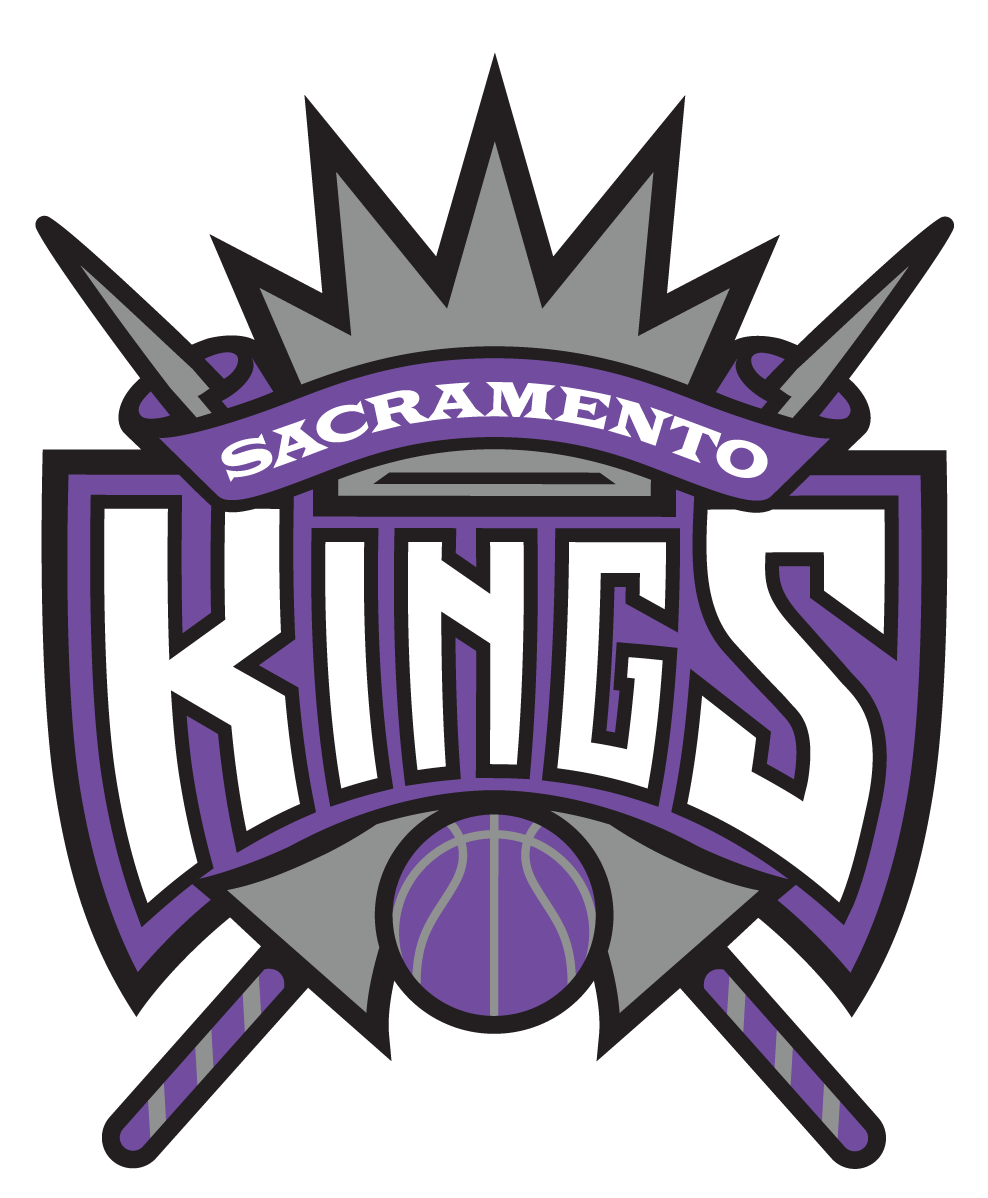
- 1994 — 2016 The redesign of 1994 brought a sharp and modern crest to the Sacramento Kings’ visual identity.
- Now the purple “Kings” lettering is separating two parts of the crest from each other, and the “Sacramento” inscription is written above it, in white and placed on a purple background.
- The logo looks sleek and stylish, reflecting the progressiveness of the club and its professionalism.
- Sacramento Kings Colors PURPLE PANTONE: PMS 268 CMYK: (81,100,12,2) RGB: (91,43,130) HEX: #5A2D81; GRAY PANTONE: PMS 431 CMYK: (15,0,0,65) RGB: (99,113,122) HEX: #63727A; BLACK PANTONE: PMS BLACK CMYK: (30,0,0,100) RGB: (6,25,34) HEX: #000000;









Leave a Review