Royal Enfield logo and symbol, meaning, history, PNG
- Download PNG Royal Enfield Logo PNG The most recent step in the evolution of the Royal Enfield logo took place in 2013-2014 when the brand identity went through a complete overhaul including the wordmark, the crest, and the seal.
- Meaning and history The India-based motorcycle manufacturing brand Royal Enfield has British roots.
- Back in 1851, George Townsend founded a business making sewing needles in Redditch, Worcestershire, England.
- The business went a long way before it started manufacturing motorcycles and motorcars (in 1901 and 1902 respectively).
- The motor production became an independent subsidiary and was incorporated in 1906.
- As it reported a substantial loss, the business was sold to Birmingham Small Arms Company.
- Albert Eadie and BSA produced a variety of military riffles, cycle components, and motorcars.
- Later, the business was purchased by Birmingham’s Alldays & Onions Pneumatic Engineering.
- In 1955, Enfield Cycle Company created a division in India in collaboration with Madras Motors.
- Here, the 350cc Royal Enfield Bullet motorcycle was manufactured.
- While the main business ceased to exist in 1978, the Indian factory is still quite commercially successful.
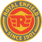
- The crest symbol Similar to the old crest, the updated version features a canon.
- The updated version also includes the wordmark and the lettering “Since 1901.” On the whole, the new crest looks a bit cartoonish in comparison with its predecessor.
- On the downside, it lacks the genuinely vintage style of the previous version.
- While a simple and minimalistic design is basically not a bad thing, the approach doesn’t seem beneficial here.
- For years, a pair of wings has been among most often used symbols meaning “speed.” Many car or motorcycle logos feature wings.
- Here, the wing theme lacks a unique touch that could have made the Royal Enfield logo stand out among other “winged” emblems.
- The difference in height between the initials and the lowercase letters is smaller in the second logo.
- While the serifs have grown less prominent, the type is still very distinctive due to the pairs of letters merging together: the “R” and “O,” the “E” and “N,” the “L” and “D.” Font The type used on both the crest and the seal appears to be Emigre’s Brothers Bold.
- The colors “rhyme” with the motorcycles on which the Royal Enfield logo is placed: the grey fits the silvery details, the yellow fits the gold details, while the red “rhymes,” for instance with the color used for the arrow on some of the devices.






Leave a Review