evolution history and meaning
- The brand was established in 1976 by Monsanto and is owned by Bayer since 2018.
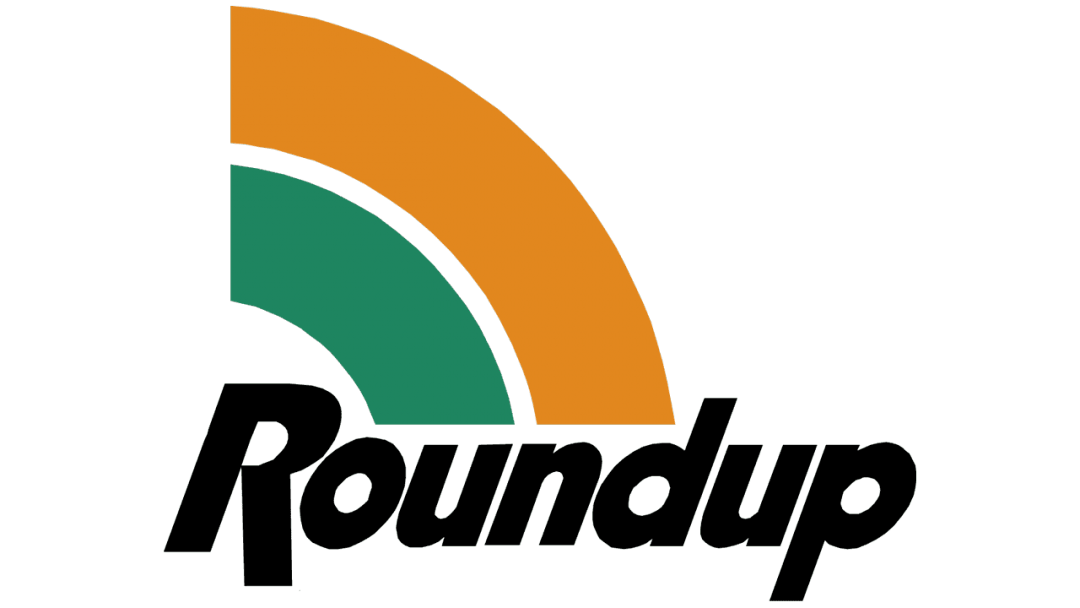
- Meaning and history The Roundup logo is bright and memorable.
- The wordmark consists of two parts: strict and straight “Round” is written in a bold black typeface which is sans-serif.
- The lettering is condensed and slightly narrowed.
- Due to the inclination, it looks less heavy and more elegant.
- The color used for the “Up” is bright green, which is the symbol of nature and energy.
- The only non-text element of the Roundup logo is an orbit, which is three-dimensional and features different colors depending on the type of the product.
- The color of the rounded line is always accompanied by the package cap of the same shade.





Leave a Review