Rolling Stones logo and symbol, meaning, history, PNG
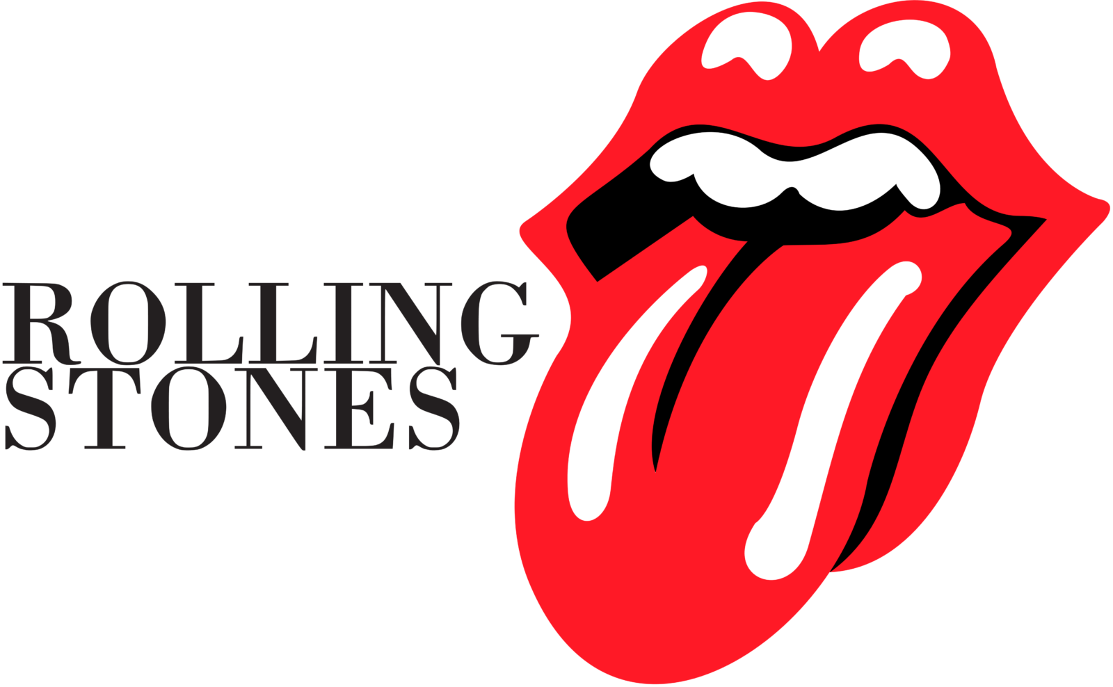
- Download PNG Rolling Stones Logo PNG Designed for mere £50, the iconic Hot Lips logo has been in use for almost half a century.
- Meaning and history The idea of branding a music band with a single logo was a somewhat novel approach in 1969.
- The musician gave Pasche his instructions and had the job done in just a fortnight.
- The Rolling Stones logo, which has been referred to as “Tongue and Lips” or just “Hot Lips,” first appeared on 1971’s Sticky Fingers LP.
- One of the characteristic features of the goddess is an impressive mouth with a tongue sticking out.
- Jon Pasche claimed that the idea of a mouth symbol sprang to his mind the very moment he saw Mick Jagger in person for the first time.
- Also, both Pasche and Jagger appreciated the sexual connotation behind the design, as well as its anti-authoritarian attitude.
- Jon Pasche reportedly received as little as £50 (about $77) for the Rolling Stones logo.
- However, when the Stones saw the emblem, they were impressed by it so much that they paid him extra £200.
- He worked with the band for the following four years, became known in musical circles and found a lot of customers here, from Paul McCartney and The Who to Jimi Hendrix and Judas Priest, to name just a few.
- Eventually, he sold the original draft or the Hot Lips logo to the London museum V&A for $92,500.
- Font Although The Stones have a unique logo, they do not actually possess a distinctive wordmark, so the name of the band can be given in a variety of typefaces.
- It was probably the most logical color choice, not only because red is the natural color of human lips and tongue, but also because it is the color of passion and rebel.
- Video


Leave a Review