evolution history and meaning, PNG
- Download PNG Redken Logo PNG Redken is a famous hair care brand, which was established in the United States in 1960, and today is a part of the L’Oréal Group.
- The brand is used by professional hair-salons all over the globe, as its styling and coloring products are of very high quality.
- There are also lines for home use, which can be bought in the stores worldwide.
- Meaning and history Red ken is one of the most widely used by professionals hair care brands and has proved its efficiency by releases innovative products and fresh lines almost every year.
- The Redken logo hasn’t changed much since the day of its introduction.
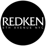
- The Redken logo is composed of the main wordmark, written in all capitals above a lightweight serif “5th Avenue NYC” tagline, also in capitals, but with thinner lines and more space between the letters, which add freshness to the logo and balances it.
- Throughout the brand’s history, its logotype was executed in two different fonts, but both had a similar mood and evokes a sense of elegance and luxury.
- Font and color The sleek and recognizable Redken wordmark can be seen in two serif typefaces: the original version, in a font, which is very close to Friz Quadrada Std Roman with its playful sharp serifs and a friendly mood, and the more delicate and modern inscription, written in a modified Mories Bold with shorter serifs and straighter lines.
- Both logotypes are accompanied by a light modern tagline, which looks fancy and contemporary despite the use of a traditional serif font.
- The tagline looks airy and fresh due to a lot of space in and between the symbols and adds a sense of confidence and professionalism to a sophisticated nameplate.
- The official color palette of Redken is monochrome, which is a common choice for brands, connected with the beauty and fashion industries.
- It looks modest yet powerful and timeless.
- When placed on the product packaging, the logotype is usually executed in white, like the shampoo and styling bottles of the brand use such light colors as purple, blue, pink.
- Some lines of the label have their packaging in red and gold, and on them the “Redken” inscription is drawn in a light gold shade, evoking a sense of luxury and high quality.


Leave a Review