Contents
Premier League of America (PLA) logo and symbol, meaning, history, PNG
- Download PNG Premier League of America Logo PNG Although the Premier League of America was active only from 2015 through 2017, it left behind two memorable logotypes.
- Meaning and history 2015 The earliest Premier League of America logo was given in cool blue and metallic shades, which was only natural taking into consideration the league’s original name (Great Lakes Premier League).
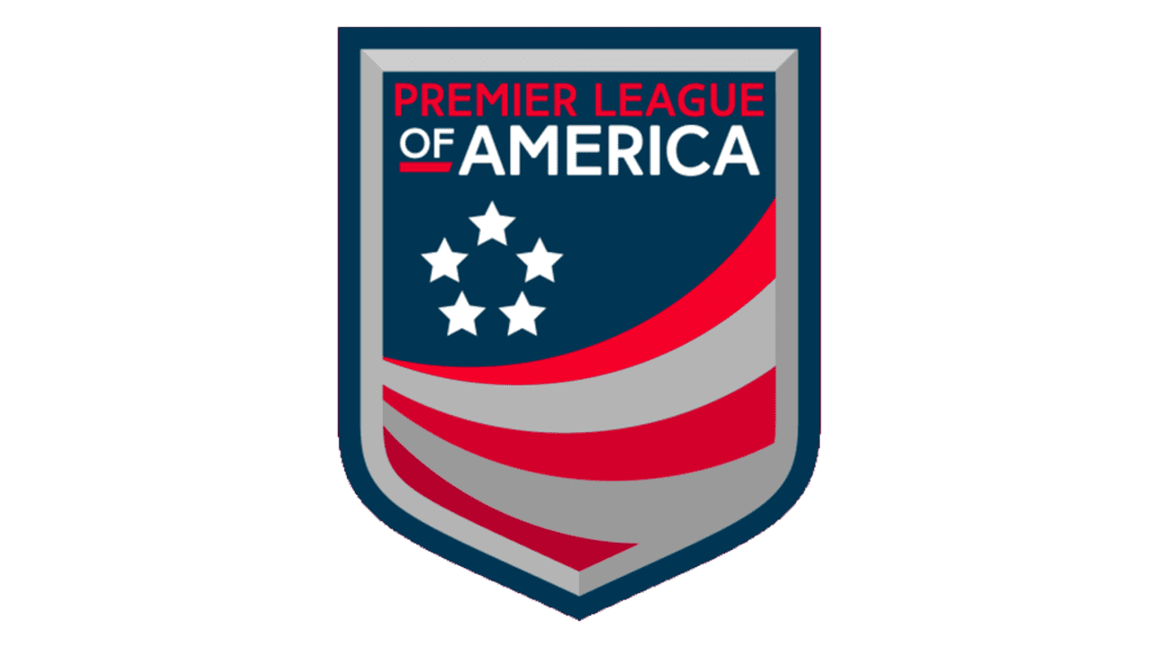
- 2016 — 2017 The second PLA logo featured the same shield as its predecessor, but it looked entirely different.
- To begin with, the palette now included red, while dark blue became much more prominent.
- The overall look was now by far darker.
- Also, the anchor of the original logo was replaced by five stars.






Leave a Review