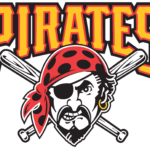
Pittsburgh Pirates logo and symbol, meaning, history, PNG
- Meaning and history The visual identity history of Pittsburgh Pirates is pretty intense, considering the number of its emblem’s redesigns, though all of the versions created can be divided into just two groups: the “P” and the Pirate Portrait.
- Both groups have an equal amount of badges, executed in different styles and colors.
- 1900 — 1907 The very first Pittsburgh Pirates badge depicted a dark blue wishbone “P” with its vertical bar forked at the bottom.
- 1910 — 1914 The single blue “P” comes back to the Pirates’ visual identity in 1910, changing its style to a classy yet strict serif, with clean contours and square cuts of the edges.
- 1915 — 1919 The redesign of 1915 changed the Royal blue color of the emblem to the scarlet red, which made the redrawn in a wishbone style “P” evoke a sense of passion and determination, along with elegance represented by its smooth lines and pointed ends.
- 1920 — 1921 In 1920 the royal blue color comes back to the Pirate’s logo.
- 1923 — 1933 The red color comes back to the Pirates’ logo in 1923, and this time it is the main color of the bold wishbone “P” with a thick blue outline.
- The clean and modern contours of the letter make it look stylish and sleek, while the bright color palette represents power and passion.
- 1934 — 1957 The first portrait logo was introduced by the club in 1935 and stayed with it for almost twenty years.
- Though this version of the logo was only used for a year.
- It was vertically oriented and had a white and black pirate portrait in it, with the capitalized “Pirates” wordmark under it, executed in a bold typewriter-style font.
- The enlarged yellow wordmark in a black outline was placed on the top part of the emblem, having its bottom line slightly arched from the center; and its letters ends elongated and curved.
- 1997 — 2013 A more aggressive look was given to the Pirates logo in 1997.
- The wordmark gained square contours and an additional red outline, and the pirate’s face liaised dangerous and strong.
- The portrait was placed on two crossed baseball bats and overlapped the bright yellow lettering on its bottom part.
- There were also two additional emblems used by the club during that period — a monochrome circular badge with a bright yellow “P” in the center, and a black pirate flag with the two crossed baseball bats replacing the sabers.
- This time it is a sleek yellow “P”, which was taken by the club from the additional emblem, created in 1997.
- The type can be found in the Internet under the name of MLB Pirates.
- This is the typeface used on the wordmark, which features both the words of the team’s name in two lines.
- Color The primary Pittsburgh Pirates logo comprises only two colors – gold and white.


Leave a Review