Peoria Rivermen logo and symbol, meaning, history, PNG
- Download PNG Peoria Rivermen Logo PNG The logos with the wordmark “Peoria Rivermen” are numerous as there have been several clubs named Peoria Rivermen.
- Meaning and history Being based in Peoria which is a river port in Illinois, the Southern Professional Hockey League’s franchise sticks to the water theme as far as its logo is concerned.
- The wordmark was set against the wheel, at the bottom of it.
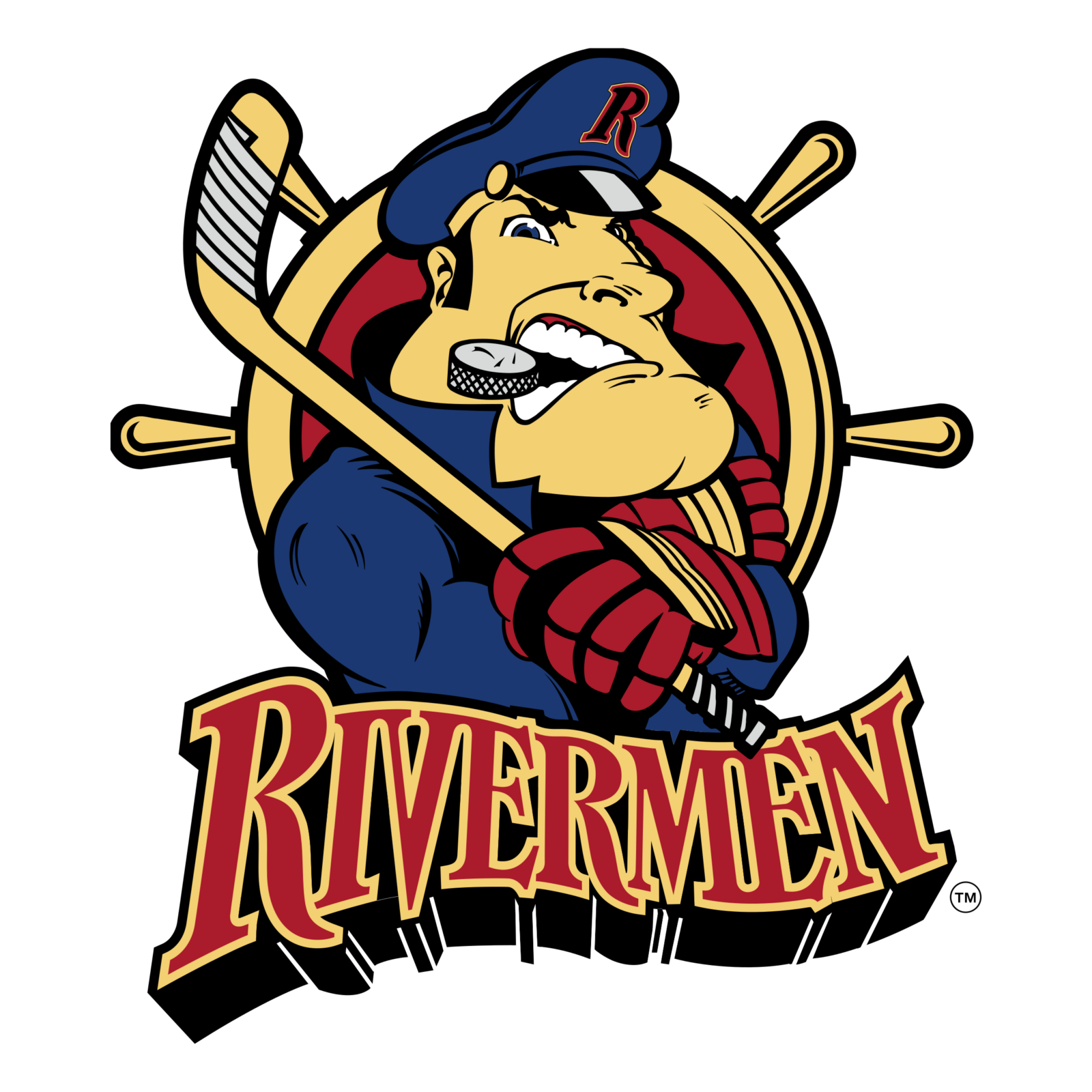
- 1984 – 1996 The first logo for Peoria Rivermen was created in 1984 and stayed with the club for a decade.
- It was a bright caricature of a sailor in a dark blue uniform, with a hockey puck in his teeth and a hockey stick in his hands.
- 1996 – 2005 The redesign of 1996 has slightly changed the composition of the club’s visual identity.
- The captain remained the main hero, though now he was balding the steering wheel, where the red city landscape and arched “Peoria” lettering were drawn.
- The black puck in the man’s teeth turned white, and the red inscription became sharper and changed its color palette to dark blue and yellow.
- This made the whole badge look calmer yet also stronger and more professional.
- 2013 – 2015 The first Peoria Rivermen logo of 2013 used the elements from the 31-year history of the Peoria franchise.
- Inside the circle there was the skyline of the city of Peoria, white on gold, and the Illinois River in navy blue and gold.
- The designer reversed the colors of the city skyline and placed the wordmark across the middle of the wheel.
- The logo keeps the team’s official colors ‒ red, navy blue, white and gold.
- Video


Leave a Review