Orlando City logo and symbol, meaning, history, PNG
- Meaning and history Before becoming a strong MLS team, Orlando City FC played one Austin, Texas, under the name Austin Aztex, until 2010.
- Then the club moved to Orlando and played in the USL league for three years, and finally, in 2014 they became an MLS team.
- 2010 — 2012 The first logo for the Orlando City club was introduced in 2010.
- It was a purple crest with a red outline and an image of three lions’ heads, drawn with their mouths open.
- The “Orlando City” wordmark in white was placed inside the crest from above and under the lions’ image.
- It was executed in a sharp and sleek serif typeface with bold lines and delicately pointed serifs, which balanced the sharp teeth of the animal mascot.
- The main color palette of the logo, purple and red, was a representation of power and courage, white the white and golden-beige details added a sense of loyalty and reliability of the club.
- Nothing else was changed, just the contours started looking cleaner and bolder.
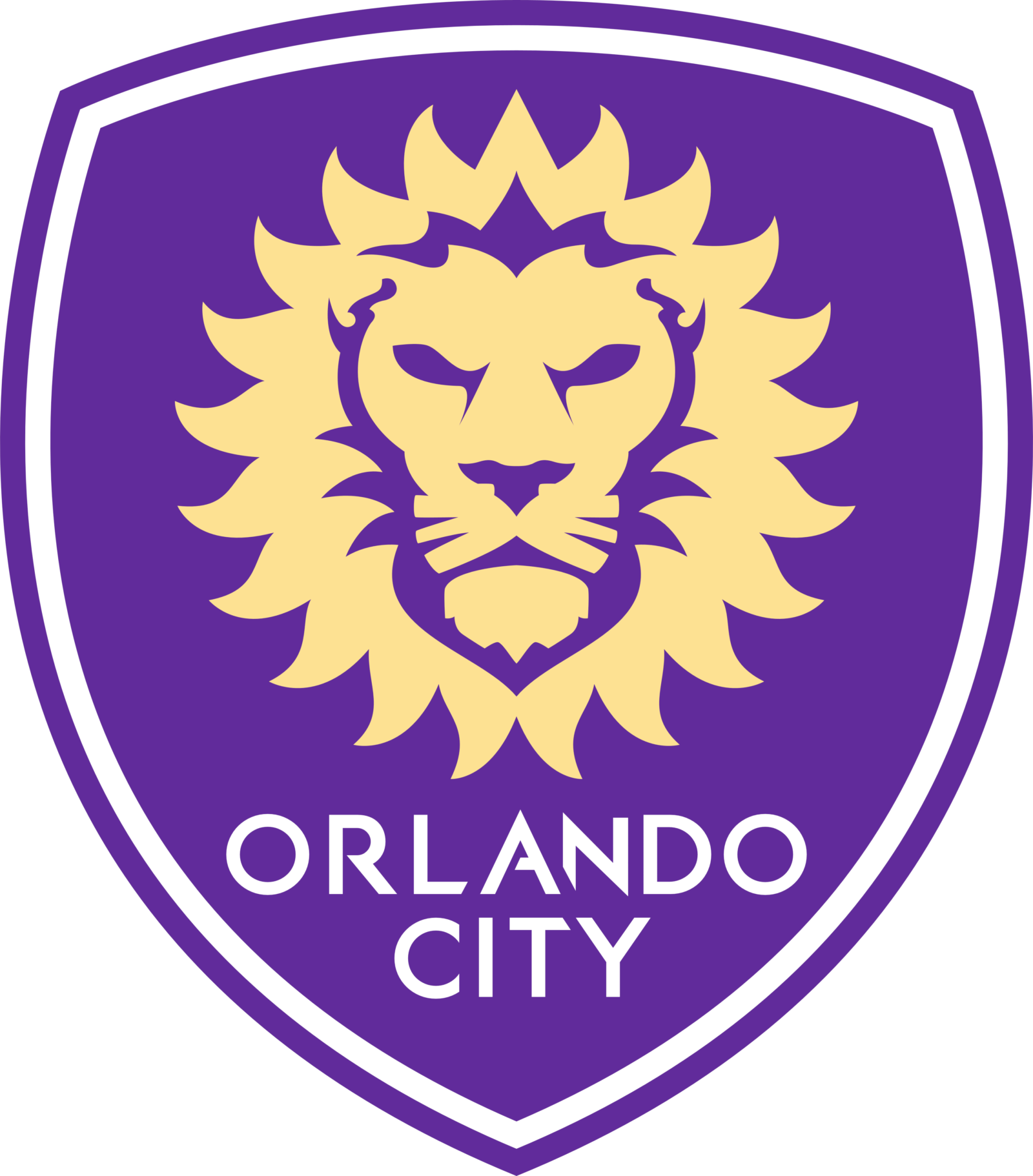
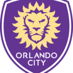
- 2014 — Today Orlando City FC joins Major League Soccer in 2014 and reveals a new logo, which we all know today.
- The new crest is executed in deep purple with a double purple and white outline and a yellow emblem in the middle.
- The emblem features an image of the lion’s head, with its mane drawn like an Aztec sun.
- The “Orlando City” wordmark is written in white under the emblem and uses a modern sans-serif typeface with thin distinct lines and stencils.
- The new purple, yellow, and white color palette of the Orlando City FC reflects con-fidence, energy, and professionalism.
- Looking modern it evokes a sense of respon-sibility and trustworthiness.





Leave a Review