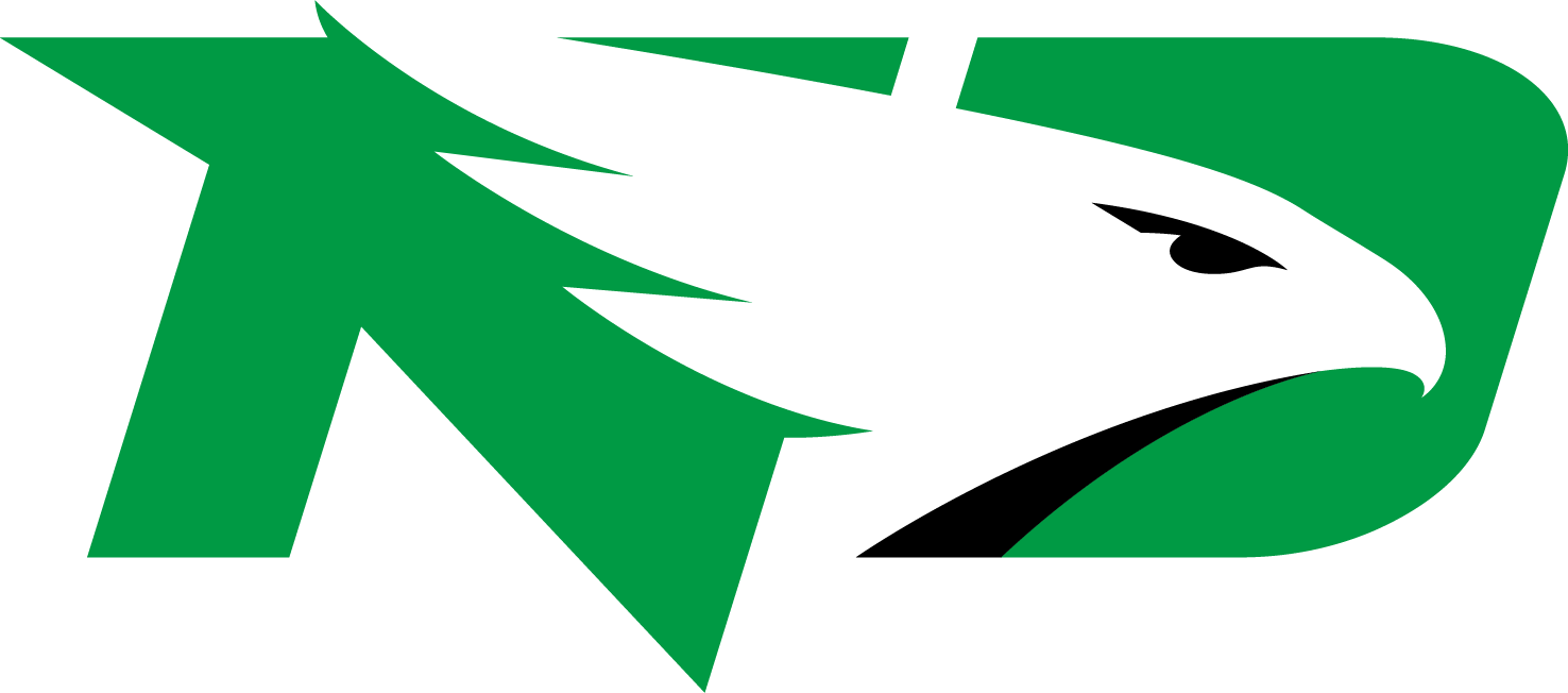
North Dakota Fighting Hawks Log
- The program includes around 17 varsity teams.
- Meaning and history 1959 – 1972 The very first logo for the program was designed in 1959 and stayed unchanged for more than a decade.
- The man was drawn in a slightly caricaturish manner and had all bright elements in his headpiece — a green band and two yellow feathers.
- 1976 – 1999 The redesign of 1976 introduced a completely new badge, which was modern and pretty abstract.
- It was a green and white geometric drawing of a Native American man placed in profile to the left.
- The image was executed with bold lines and softened triangles in both green and white.
- The Native American man was still drawn in profile, but this time facing to the right.
- As for the drawing itself, it was detailed and more realistic, though still had something caricaturish in it.
- The feathers got more white and black accents and yellow was only in a couple of lines.
- 2007 – 2011 In 2007 the man started looking to the left, like on the logo from 1976.
- The style remained untouched, as well as the color palette, but all the lines of the emblem were straightened up and strengthened so that the logo started looking more professional and confident, evoking a sense of determination and power, and representing the club’s character.
- 2012 – 2015 In 2012 North Dakota Fighting Hawks started using a text-based logo, with an intertwined “ND” monogram placed above the “North Dakota” inscription in the uppercase.
- What is North Dakota Fighting Hawks?
- The program consists of 17 men’s and women’s teams, which compete in Division I of NCAA in such sports disciplines as Basketball, Football, Tennis Gold, and others.


Leave a Review