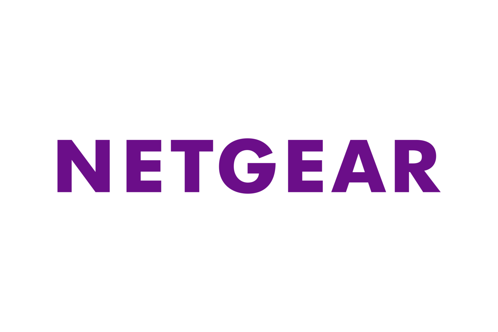
Netgear logo and symbol, meaning, history, PNG
- Download PNG Netgear Logo PNG Netgear is a global computer-hardware manufacturer, which was established in 1996 in the United States, and today operates in more than 20 countries across the globe.
- The company specializes in the production of routers and various WiFi accessories and has a yearly revenue of about 1,5 billion USD.
- Meaning and history The Netgear visual identity was changed just once, in 2014, but for those who do not pay attention to small details, the only new thing in it is the color palette, as there are not many differences between the original minimalist wordmark and the new one.
- 1996 — 2014 The very first logotype for Netgear was executed in a bold sans-serif typeface, with only capital letters.
- The typeface of the wordmark was very similar to the famous Futura Maxi Pro Bold and has its letters placed pretty far from each other.
- There were two versions of the color palette, used by the brand — the main one was electric blue, a color, representing technology, progress, and high quality, and black, which was mainly used for the official documents, making the logo strict and professional.
- 2014 — Today With the redesign of 2014, the logotype was slightly refined.
- Though the typeface was changed to a new one, it still features straight clean lines, solid shapes, and right angles.
- The lettering on the current logo is a bit extended and the symbols are placed closer to each other, which makes the whole inscription more balanced than it was earlier.
- Another change was made to the color palette now the brand uses a calm purple shade along with the black one.
- Purple evokes a sense of creativity and mystical power and is not a very common color for visual identity design, so it makes the brand’s logo stand out in the list of competitors.


Leave a Review