Minnesota United logo and symbol, meaning, history, PNG
- It is owned by Bill McGuire and has Adrian Heath as the head coach.
- Meaning and history The club we know today under the Minnesota United name was born in 2010 as NSC Minnesota Stars, and then was renamed to Minnesota Stars FC in 2012.
- So the first two logos of the team were linked to the “star” part of the name, and this concept changed in 2013 after the name was changed again.
- 2010 — 2012 The very first logo for NSC Minnesota Stars was composed of a sleek blue shield with yellow and white details.
- The shield itself featured gradient shades of blue, from dark to electric, which made it look vivid and cool.
- Two yellow smooth lines were coming out from the pointed bottom part of the badge and finished at the upper edge.
- The yellow “NSC” inscription was enlarged and placed on the top of the crest, with white a mind thin “Minnesota” under it.
- 2012 — 2013 The logo was redrawn in a flat and more cartoonish manner in 2012, after the first name change.
- The color palette and composition remained the same, but all the contours and style were switched.
- The “Stars” wordmark was placed under the star on an arched banner, while the “Minnesota” lettering in white capitals was written on the very top of the crest.
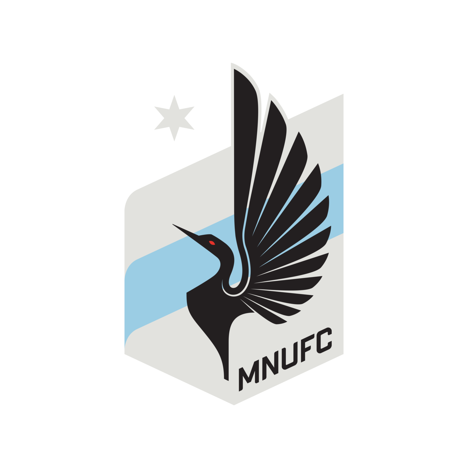
- Today their logo is composed of a light gray and blue shield with a diagonal pattern.
- The main part of the shield depicts an elegant blackbird, placed in profile with its wings spread up.
- The “Minnesota United FC” lettering is written in black sans-serif and placed diago-nally along the bottom right side of the badge.
- Minnesota United Colors GREY HEX COLOR: #585958; PANTONE: 431 U LIGHT GREY HEX COLOR: #D8DAD9; PANTONE: 427 U BLACK HEX COLOR: #231F20; PANTONE: 412 U RED HEX COLOR: #DF2426; PANTONE: 1797 U BLUE HEX COLOR: #9BCDE4; PANTONE: 2905 U





Leave a Review