New York Mets logo and symbol, meaning, history, PNG
- Download PNG New York Mets Logo PNG The New York Mets logo has stayed almost the same since it was created in 1962.
- Only three hardly noticeable modifications have been made.
- Meaning and history New York Mets are the baseball club that has probably the least amount of its logo redesigns, as it still uses two emblems, designed in 1962, and just one of them was slightly refined and modernized throughout the years.
- The original emblem of the club was taken from the last logo of New York Giants when the club splint in two and turned into San Francisco Giants and New York Mets.
- 1962 — Today The logo, borrowed by New York Mets from New York Giants, was composed of two red overlapping letters “NY” placed vertically (with the “N” higher than the “Y”).
- Both letters had their lines’ tails forked, curved and pointed, except for the upper bars of the “E”, which were just arched to the sides, resembling sharp animal horns.
- 1962 — 1998 Later in the same year, a new badge was created for the club.
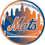
- It was a rounded white, blue and orange emblem with the skyscrapers landscape contouring, orange stitched and a bold cursive “Mets” inscription executed in thick orange lines with a thin white outline.
- On the left from the main wordmark, there was a tiny orange “NY” symbol with both letters in a simple sans-serif typeface.
- The emblem featured a distinct orange frame and resembled a baseball.
- 1999 — Today The redesign of 1999 removed the “NY” monogram from the emblem and elevated its color palette, using a brighter and darker shade of blue for the New York City landscape and a more intense orange, closer to coral, for the stitches and the nameplate.
- Font The logo uses a beautiful script typeface resembling handwriting.
- Color The New York Mets logo has stayed consistent in terms of the color scheme (orange, blue, and white).
- Only slight color changes have been made.





Leave a Review