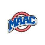
Metro Atlantic Athletic Conference Logo
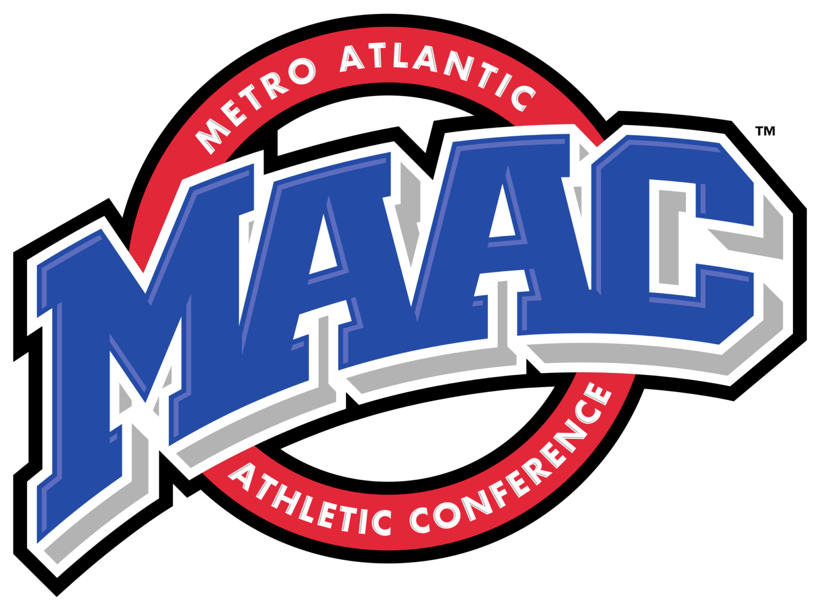
- Download PNG Metro Atlantic Athletic Conference Logo PNG Although the Metro Atlantic Athletic Conference logo does not include any apparent sports symbols, it has a dynamic athletic feel.
- Meaning and history At the very center of the design, there is the abbreviation “MAAC” in capital letters.
- The glyphs look pretty heavy and feature unusual serifs on the tops of the first three letters.
- The letters are blue with grey, white, and black shades adding some dimension.
- Also, the proportions are distorted in such a way that the letters seem to have been written over a transparent sphere rather than over a flat surface.
- In the background, there is a red ring housing the full name of the conference in white.




Leave a Review