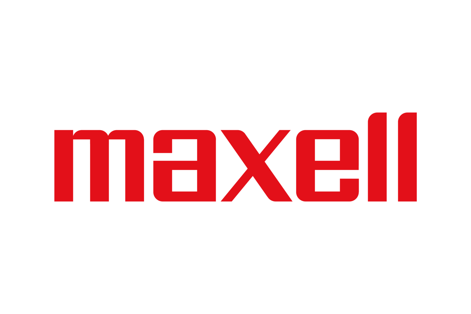
Maxell logo and symbol, meaning, history, PNG
- Download PNG Maxell Logo PNG Due to its effortless and minimalist style, the Maxell logo has remained virtually unchanged for decades.
- This is one of the comparatively rare examples of timeless logotypes.
- What is the secrete behind its longevity?
- Meaning and history Maxell Holdings, Ltd. is a consumer electronics company based in Tokyo, Japan.
- The name of the company is the abbreviation of “maximum capacity dry cell.” While the list of products it makes is rather long, it has been best known for its batteries, wireless charging solutions, computer tapes, and professional broadcast tapes, as well as the audio cassettes and blank VHS tapes it used to produce.
- The company was formed in 1960.
- Emblem The logo showcases the word “Maxell” in a type that is both creative and highly legible.
- Each of the letters has a unique, unusual touch.
- There is a clear tendency for the rectangular shape, which is especially visible in case of the the “a” and “e.” And yet, many of the angles are rounded.
- Even the top ends of the “l’s” are slightly rounded.
- We can say that the authors of the wordmark have predicted many of the current trends, for instance, the tendency for minimalist design.
- More importantly, they have managed to create a memorable style without sacrificing legibility.
- In addition to the wordmark, the company also uses a version with the tagline “Within the Future.” Colors The main color of the Maxell logo has always been red.
- There has been some playing around with the shade, though, as the current version seems a little colder than the original one, there is a barely perceptible blue mixture.


Leave a Review