evolution history and meaning
- Download PNG Jerzees Logo PNG Jerez era is a brand of basics and activewear manufacturer, which was established in 1984.
- Today the brand is mainly focused on the plain t-shirts and hoodies wholesale to other fashion labels.
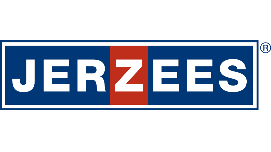
- Meaning and history The Jerzees’ visual identity is text-based and very laconic.
- The wordmark in all capital letters is executed in a traditional sans-serif typeface with strong bold lines, that are neat and clean.
- The color palette of the logo is blue red and white, where the blue inscription on the white background has just one red detail.
- It is the letter “Z” in the middle of the brand’s name.
- Executed in red it adds a sharp feeling, representing the strong and passionate company, which aims to provide good quality products.
- The red “Z” is a symbol of energy and dynamics.


Leave a Review