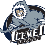
Jacksonville IceMen logo and symbol, meaning, history, PNG
- The predecessors of this ice hockey team were the Muskegon Fury (1992-2008), the Muskegon Lumberjacks (2008- 2010) and the Evansville IceMen (2010- 2016).
- The black bold lettering was set diagonally over the green element and had an enlarged image of the hockey puck, also in black, placed under it.
- 1997 — 2007 In 1997 the club gets a mascot — a funny angry figure in turquoise and purple, which also resembles a hurricane swirl.
- The wordmark was now drawn in purple with a turquoise shadow and placed under the emblem, with a thin white banner and black “Muskegon” tagline placed over the last letters.
- 2008 — 2009 The first logo with the word “IceMen” appeared in 2008 when the new name was unveiled.
- It features a fierce looking Yeti-like creature that looks as if it is going to tear you to bits.
- It was adopted, though.
- 2008 — 2010 In 2008 the name of the team was changed to Muskegon Lumberjacks, and the logo was changed again.
- The new concept included an image of a bearded man with an ax stylized as a hockey stick.
- The man was placed above the narrowed and stylish lettering, where the “Lumberjacks” part was enlarged and written in white letters under the beige “Muskegon”.
- 2009 — 2011 Two seasons later the IceMen altered their logo ‒ the man in it looks like a forward player in action.
- The color palette was simplified and the shade of blue, used for the logo became softer and colder.
- 2017 — Today The last redesign was in 2017 due to the team’s relocation to Jacksonville.
- The team color scheme includes navy blue, sky blue and white.


Leave a Review