Gent Logo logo and symbol, meaning, history, PNG
- Meaning and history The visual identity history of the football club from Belgium can be split into two pe-riods — the first part, from the club’s foundation and until the beginning of the 1970s, and the modern era, which started in 1971 and continues today.
- Each segment was outlined in gold and contained one of four letters of the club’s name.
- The ornate red crown was set on top of the crest.
- 1959 — 1971 With the redesign of 1959, the club got a more modest and professional logo, which consisted of a white shield in a thick gold outline with a wide blue banner on top.
- Five Olympic Rings in blue were placed on a white background.
- Four of the rings had blue “ARAG” letters inside, and the fifth one, in the middle — the golden crown.
- 1971 — 1980 A completely new style comes to the club’s visual identity in 1971.
- The Native American man portrait in the profile is now the only element of the logo.
- 1980 — 2009 In 1980 the gold shade is removed from the logo and the Indian man is redrawn in a more detailed manner.
- A. Gent” inscription is now placed in an outlines rectangle under the portrait.
- Executed in sharper and more con-fident lines, the Native American man, facing left is now complemented by enlarged lettering with no outline.
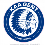
- 2013 — Today The Indian got a more powerful look and changed his direction to the right in 2012.
- Under the nameplate, there is a “Stamnummer 7” tagline with two horizontal lines from both sides.
- Video


Leave a Review