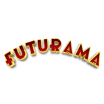
Futurama logo and symbol, meaning, history, PNG
- Download PNG Futurama Logo PNG Futurama is a famous animated series, telling about the interplanetary adventures of the main character, Philip Fry.
- The sitcom was created by Matt Groening in 1999 and by today 140 episodes were released in 7 seasons.
- Meaning and history 1999 – 2003, 2008 – 2013 The simple text-based Futurama logo is modern and memorable.
- Composed of a wordmark in a contrast color palette, it looks confident on any background and ap-pears at the beginning of every Futurama episode.
- The Futurama nameplate in all the capital letters is executed in a custom hand-drawn sans-serif typeface, with a slightly elongated horizontal bar of “R”, the letter “F” forming kind of cross and the horizontal bars of both “A” replaced by triangles with their peach facing down.
- The Font based on the Futurama logotype was created by Darrell Johnson and is called “Futurama”.
- The pointed tops of “A”s and “M” make the whole logo look sharp and futuristic as if they are pointing into the future, or up in the Space.
- The three-dimensional lettering features red color, which boasts gradient shades in order to add a sense of motion, in a thin yellow outline, which makes the inscription more distinct and visible.


Leave a Review