evolution history and meaning
- The brand, owned by General Motors since 2001 and specialized in the production of affordable cars along with buses and commercial vehicles, stopped operating in 2011.
- Meaning a and history Despite its visible simplicity, the Daewoo logo is very meaningful.
- The South Korean automobile brand took the structure of the Universe as its basis, and it all started with the naming and as the name of the brand in Korean means “The Great Universe”.
- 1967 – 1994 The most famous Daewoo badge was designed in the 1960s and comprised an elegantly rounded emblem with a bold wordmark, executed in a blue and white color palette.
- The stylized picture of a circular shell was fresh and light, while the lettering featured massive shapes and thick lines.
- The combination of blue and white showed the brand as a trustworthy and responsible one.
- 1994 – 2002 The logo was redesigned in 1994 and gained new shapes and styles.
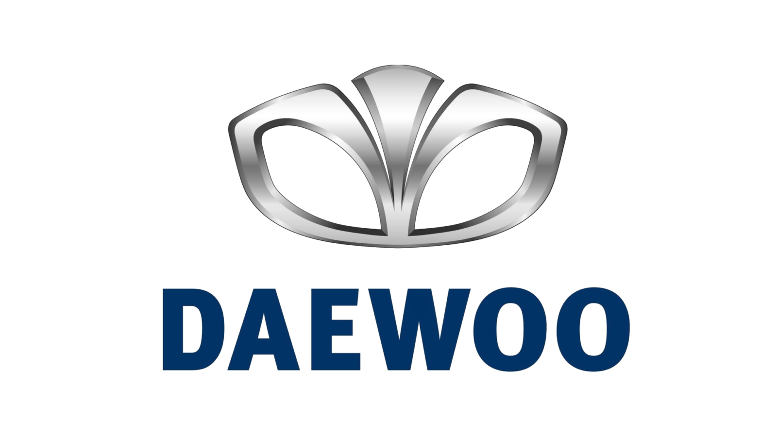
- The shell was now horizontally stretched and started resembling a flower, while the wordmark got a modern sans-serif typeface with softened angles of the letters, and the “A” repeating the shape of the triangle with an open contour.
- The color palette of the badge was switched to silver and blue, where silver was used for a three-dimensional emblem, and blue was for flat lettering.
- The shell looked luxurious and sophisticated in the new palette with a glossy metallic surface, and the additions of a strict geometric sans-serif wordmark made the whole logo balanced.
- Font and color For the last ten years of its existence, the company decided to change its custom recognizable typeface to something more minimalist and simple and chose a bold straight sans-serif, which is very similar to such fonts as FF Meta Headline Pro Bold, Thrifty Black, and Vista Sans Black.
- The silver and blue color palette of the Daewoo logo was a good choice to represent the philosophy of the brand and its legacy.
- Blue stands for the universe and peace, while silver adds a sense of loyalty, unity, and reliability.
- The logos in this color palette always look professional and show the right values of the brands.








Leave a Review