Contents
Cartoon Network Studios logo and symbol, meaning, history, PNG
- Download PNG Cartoon Network Studios Logo PNG One of America’s best-known animation studios, Cartoon Network Studios is based in Burbank, California.
- Meaning and history The number of updates the Cartoon Network Studios logo has gone through during its comparatively short history has exceeded ten.
- 1994 In its original shows, the company typically used the primary logo of Cartoon Network.
- The letters were taken from the Eagle Bold type.
- The emblem was black and white.
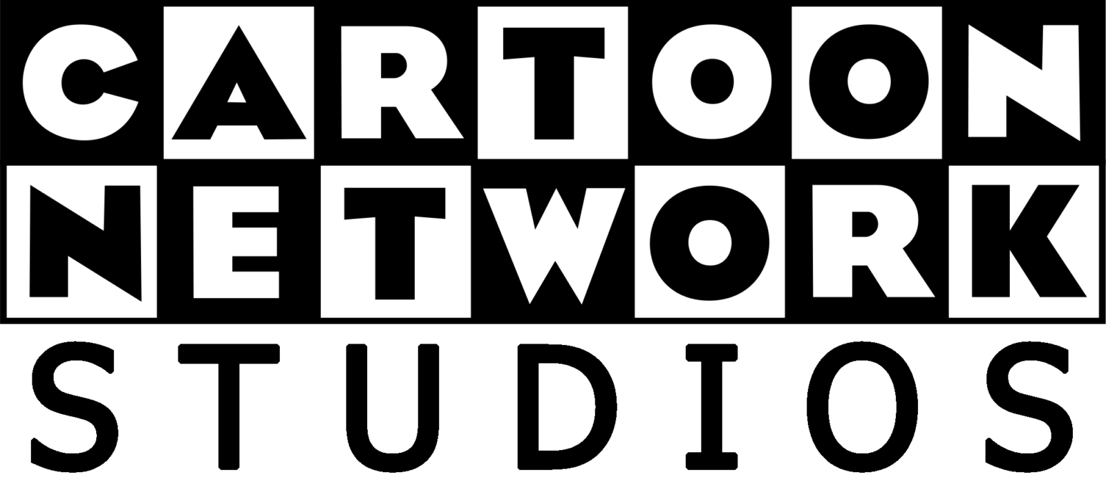
- 1996 The word “Studios” was added below the main emblem.
- It was placed on the white background and featured a different type, so it did not merge well into the logo.
- You could come across this emblem in several shorts of “What a Cartoon!”.
- 1997 The word “Studios” was included in the grid, which made the design look more wholesome.
- The checkered wordmark, which was slightly updated, could be seen below.
- This logo was also used in a slightly different variation, with more noticeable white highlights along the border of the rectangle.
- 2003 The company added a version where the word “Studios” looked blurred.
- It was dominated by the 3D letters “C” and “N” with the full name of the brand below.
- Video





Leave a Review