Boca Raton Bowl Logo
- Download PNG Boca Raton Bowl Logo PNG While the Boca Raton Bowl logo is not very unique, its joyful holiday mood places it among the logos that are pleasant to look at.
- How has the design team achieved this effect?
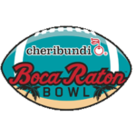
- Meaning and history 2014 The Boca Raton Bow logo from 2014 featured a bright turquoise horizontally oriented rugby ball as the body of the emblem.
- The bright pink cursive lettering in a bold dark blue outline was written over the ball, slightly coming out of its borders in the beginning and the end of the inscription.
- 2015 With the redesign of 2015 the pink lettering was changed to the red one, with the contours of all letters slightly extended.
- The upper part of the turquoise badge now contained a solid red logotype of the new sponsor, Marmot.
- It was written in the corporate serif typeface and complemented by the emblem on the left.
- The Marmot emblem is a solid red circle with a sharp stylized as the mountain peaks letter “M” in white.
- 2016 The sponsor logotype was removed from the logo again for the season of 2017, and the Boca Raton badge, designed in 2014 was brought back.
- The only difference was in size — all elements of the logo got enlarged, thus the whole image started looking more powerful and confident despite its tender and even feminine color palette.
- 2017 – Today To begin with, we should mention the choice of colors.
- The transparent teal with white nuances brings to mind the images of transparent water and warm lagoons.
- The two palms may be a totally generic choice, yet it is a good way to make the “tropic” theme as apparent as possible.
- We should also take into consideration the selection of the typeface, which only reinforces the holiday island feel.





Leave a Review