Arsenal logo and symbol, meaning, history, PNG
- Meaning and history The visual identity of the famous English football club is based on the crest of the Metropolitan Borough of Woolwich, white it was formed.
- 1888 – 1922 The very first logo of the club depicts the Woolwich Borough crest with added laurel leaves on the sides.
- 1936 – 1949 The iconic art-deco crest of the football club was designed in 1936 and stayed with the team for 13 years.
- 1949 – 1994 The redesign of 1949 brought a Victoria Concordia Crescit to the club’s visual identity.
- It was a shield, executed in a red and white color palette, with the legendary cannon, facing west, and the “Arsenal” wordmark in the gothic style font above.
- 1994 – 1996 In 1994 the crest changed the color palette and was put on a black background in order to gain more strength and solidness.
- Now the shield was red with white contours and lettering on it, there was also “The Gunners” nameplate added above it, in a red rectangle with a thin yellow framing.
- Not much was changed on the shield itself, just the contours were refined and the Borough of Islington’s cost of arms on its bottom part was now more bright and visible.
- The lines and letters on the red shield are now colored gold.
- As for the “Victoria Concordia Crescit” inscription on the ribbon under the shield, it also gained a more modern look and is now written in a bold sans-serif, using red capital letters.
- The logo we all know now was designed, and the new color was added.
- It still is a tribute to the heritage and history of the club, but in a modern and powerful way now.
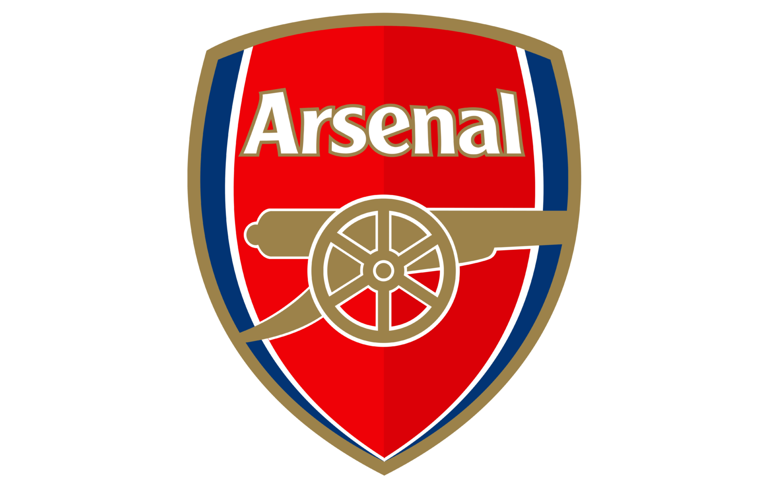
- The bold gold cannon, facing right, in the largest part of the badge.
- The “Arsenal” lettering is drawn in white with a gold outline.
- 2011 – 2012 In 2011 the special anniversary logo was designed, to celebrate the 125 years of the club’s history.
- Moreover, the narrow cannon has actually stayed the club’s most important symbol.
- It featured the narrow cannon inside a shield shape with the lettering “Victoria Concordia Crescit” beneath.
- The logo also included the word “Arsenal” in an intricate gothic font.
- So, in 2001, the Arsenal emblem went through a modification.
- Color Today, the main team colors are red, gold, blue, and white.





Leave a Review