Baltimore Orioles logo and symbol, meaning, history, PNG
- Download PNG Baltimore Orioles Logo PNG The professional baseball team Baltimore Orioles has gone through more than 15 logotypes.
- Meaning and history The name Baltimore Orioles and the symbol of the club, a bird, appeared only in 1954, though the history of the team started in 1901 with the Milwaukee Brewers club, which relocated to St. Louis, becoming the Browns, and, finally moved to Baltimore, staying there by now.
- 1902 The club changed its name to St. Louis Browns in 1902, and with the new name adopts a new color palette — brown on white.
- 1903 In 1903 the logo was rewritten and now all letters were sitting on one line, having their contours thinner and more elegant than on the previous version.
- This logotype stayed with the club for another year.
- It was a smooth delicate monogram, composed of intertwined letters placed inside a white rhombus in a brown frame.
- 1908 — 1910 For two years, starting in 1908, the club was using an elegant heraldic symbol for its visual identity.
- It was a clean and professionally executed fleur-de-lys, drawn in the chocolate brown shade and placed on a white background.
- It was a composition resembling the logo created for the club in 1906, but with the contours of the letters refined and the frame removed.
- The crest had its vertical lines in orange and brown, and a white baseball placed in the middle.
- 1952 — 1953 The redesign of 1952 brought the last emblem for St. Louis Browns — it was a portrait of an elf, executed in an orange and brown color palette.
- In the same year, a new symbol was adopted — a smiley bird, which still is the part of the Orioles’ visual identity.
- The bird in a baseball cap was sitting on a white ball with the “Orioles” inscription on it.
- 1964 — 1991 In 1964 the bird was drawn with the bat in its hands and placed on a white background, enclosed in a thick orange circular frame with white lettering around its perimeter.
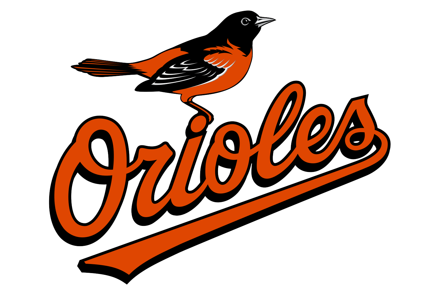
- 1992 — 1994 The logo from 1992 featured an orange script lettering with the white “Baltimore” wordmark on the logotype’s underline, and – realistically drawn bird sitting in the dot above the letter “I”.
- 1998 The color palette of the Orioles’ logo got slightly lighter, and the contours were refined.
- Its beak and eye were enlarged, while the tail was made a bit narrower and sharper.
- 2008 — 2018 The redesign of 2008 changed the color palette of the Orioles’ visual identity to red and black, removing the rhombus and placing the script logotype a bit diagonally.
- 2019 — Today The smiley bird’s face became the Baltimore Orioles primary logo in 2019.
- Color The logotype features the baseball team’s official colors: black, white, and orange.





Leave a Review