Sonic the Hedgehog Logo and symbol, meaning, history, PNG
- Download PNG Sonic the Hedgehog Logo PNG Sonic the Hedgehog is a Japanese video game series.
- Its creator and owner is Sega.
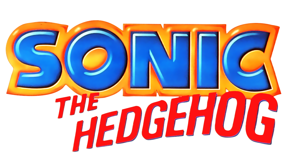
- The Sonic the Hedgehog logo has preserved its structure and shape over the years.
- Yet, there have been several minor modifications.
- 1991 – 1999 Japan/Asia Version This one shows the basic structure of the logo without loading it with multiple details.
- You can see the word “Sonic” in huge, bold letters.
- The most characteristic glyph is the “O,” which appears to have been rotated around 30 degrees clockwise.
- The lettering “The Hedgehog” below comes in an all-caps sans and is by far smaller than the main wordmark.
- International Version Vivid orange trim was added to the word on the top.
- Even the color, red, added a bright touch.
- Due to the gradient, the letters aren’t flat anymore.
- Japanese Version While preserving the style of the international logo, the local version features the name of the brand in Japanese.
- The most notable difference from the international logo, other than the typography, is the shape of the red element below the word “Sonic” – here, the rectangle has rounded ends.
- Colors Both the international and Japanese versions combine dark blue with red and a noble tint of gold.


Leave a Review