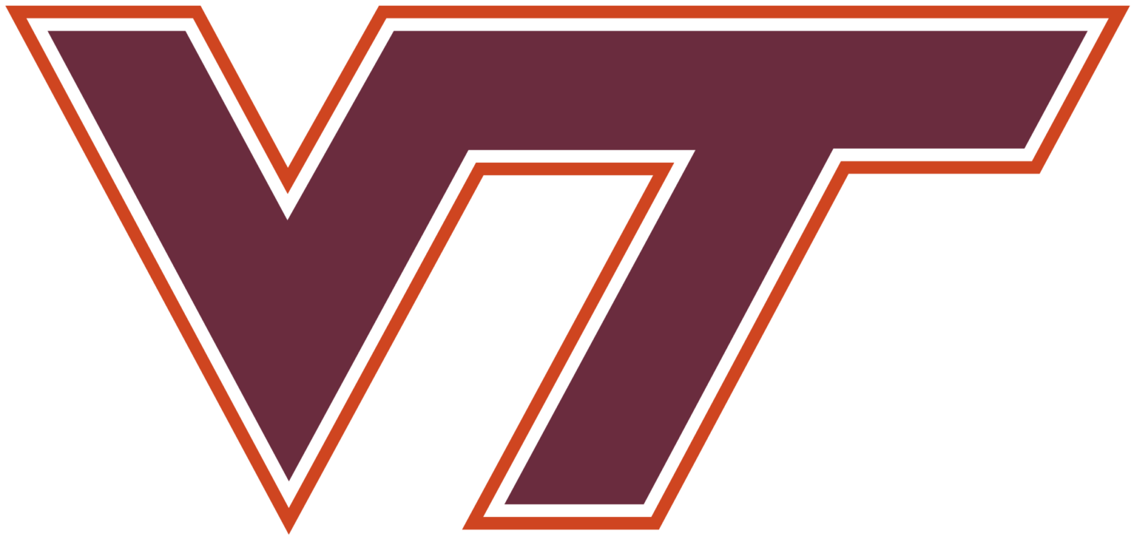
Virginia Tech Hokies Logo
- Download PNG Virginia Tech Hokies Logo PNG Neither the current Virginia Tech Hokies logo nor the previous ones have in any way alluded to the university’s mascot, HokieBird.
- It was placed above the enlarged and slightly extended “V” in a calm and dark burgundy color.
- The letters were executed in clean straight lines with distinct ended and right angles.
- 1971 – 1973 The redesign of 1971 has completely changed the style and concept of the club’s logo.
- This time it was a composition in two shades of red — with the classy intense red for the background and the dark burgundy one for the bold sand-serif “Tech” inscription placed over its.
- 1974 – 1982 In 1974 the club returned to its logo from 1966, slightly refining its contours, and making both letters a bit bigger and wider than they were in the original version.
- The color palette remained untouched and the position of the letters as they were, but the lines became bolder and cleaner.
- 1983 – Today The nickname “Hokie” comes from a spirit cheer created by a student named O.M.
- Stull in the 1890s.
- The current athletic logo (since 1983) of the Virginia Polytechnic Institute and State University features the letters “V” and “T” in maroon with white and burnt orange trim.
- The letters are positioned next to each other, while their ends merge into one another.
- What are Virginia Tech Hokies?
- Virginia Tech Hokies is the name of a college football club from Virginia Polytechnic Institute.
- Virginia Tech Hokies Colors CHICAGO MAROON PANTONE: PMS 208 C HEX COLOR: #630031; RGB: (99, 0, 49) CMYK: (41, 100, 56, 48) BURNT ORANGE PANTONE: PMS 158 C HEX COLOR: #CF4420; RGB: (207, 69, 32) CMYK: (13, 87, 100, 3)


Leave a Review