Portland Trail Blazers logo and symbol, meaning, history, PNG
- Download PNG Portland Trail Blazers Logo PNG Although the history of the professional basketball team Portland Trail Blazers has lasted around half a century, its logo has been remarkably consistent in its core emblem, which has a hidden meaning behind it.
- Meaning and history The visual identity of Portland Trail Blazers is extremely stylish and cool, and it has always been like that, since the very first version, created for the club in 1970, it looked more like a fashion or music label logo, executed in a timeless black and red color palette and using abstract sleek shapes.
- 1970 — 1990 The original logo for Portland Trail Blazers was created in 1970 and featured an abstract image composed of two intertwined parts — the left one, formed by ten black smooth lines, and the right one in red.
- The lines of the black segments were pointing up, while the red stripes — down.
- 1990 — 2002 The emblem was rotated and placed on the left from the enlarged “Blazers” lettering in 1990.
- The whole emblem was pretty well balanced, with its clean lines and neat contours.
- 2002 — 2003 The redesign of 2002 added sharpness to the iconic emblem, drawing it in black, red, and gray and slightly sharpening the ends of the lines in order to accent on the danger and strength of the basketball club.
- This was a version without any lettering and only stayed with the team for a year.
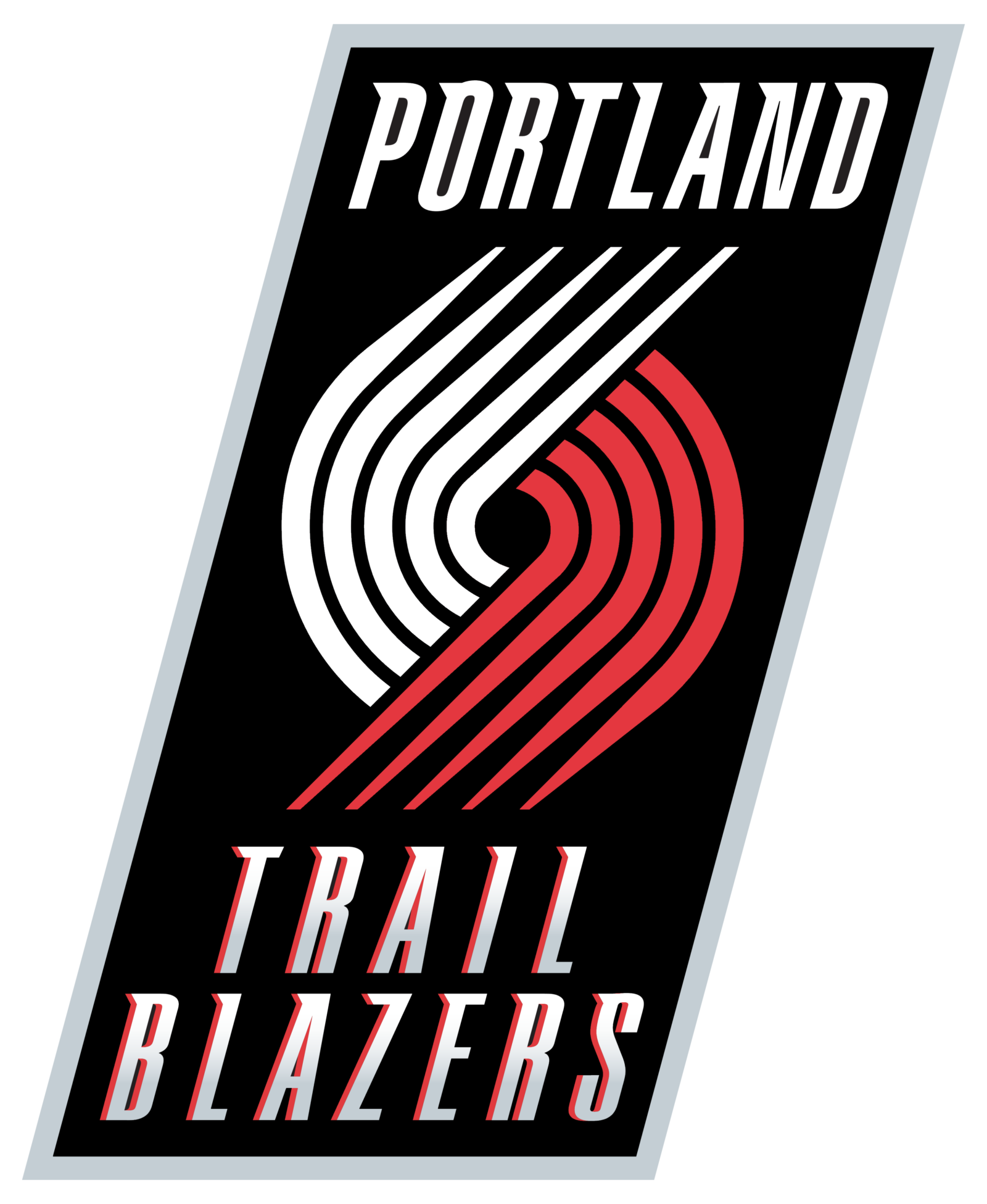
- 2003 — 2004 The new gray and red emblem was placed on a black geometric badge in 2003, with the “Portland Blazers” wordmark placed above and under it and executed in two different styles, with the upper part written in white custom font with elongated bars, and the bottom — with gray gradients and red shadow.
- 2004 — 2017 The “Trail” part was added to the bottom line of the wordmark in 2004.
- The new inscription has its “Portland” part capitalized and enlarged, and the “Trail Blazers” placed under it in smaller letters and executed in a simple Sans-serif typeface.
- Font While the glyphs are generally rather generic (and perfectly legible), the letters “P” and “T” boast distinctive sharp “claws” implying that playing with the Blazers and having them as your opponents can be quite an unpleasant experience.
- Color In spite of its simplicity, the color palette, which includes only red (PMS 186), black, and white, works great for this type of design.
- Portland Trail Blazers Colors RED PANTONE: PMS 186 C CMYK: (0, 91, 76, 6) RGB: (224, 58, 62) HEX COLOR: #E03A3E; BLACK PANTONE: PMS BLACK 6 C CMYK: (30, 0, 0, 100) RGB: (6, 25, 34) HEX COLOR: #000000;


Leave a Review