Nantes logo and symbol, meaning, history, PNG
- The shield featured green and white colors and was outlines in yellow.
- On the green part of the emblem, the yellow clipper was placed on the curved line, symbolizing the sea.
- The top part of the badge was colored yellow and has a simple and clean black “F.
- The five stars from the top of the badge were replaced by five abstract figurines, and the typeface of the inscription was now bolder and gained a thin black outline.
- 1968 — 1973 The green and yellow color palette come back to the club’s visual identity in 1968.
- The bold serif wordmark is placed around the green perimeter of the emblem’s framing and has its “Nantes” part separated from “Football Club” by two black and white footballs.
- These “four petals” will later become the club’s official symbol and the most significant part of its visual identity design.
- C. N” lettering in yellow was now placed on a black curved ribbon under the ship, and written in a thin and extended sans-serif typeface.
- The yellow ship on a green background looked sleeker now and has fewer accents than those from the previous versions.
- The thick yellow stripe above the clipper had five arrow-like symbols in green on it.
- 1988 — 1997 The first logo without a ship was created for the club in 1988.
- It was a bright yellow circle in a thin green outline and a wide green curved line, resembling a wave, where seven small yellow stars were placed.
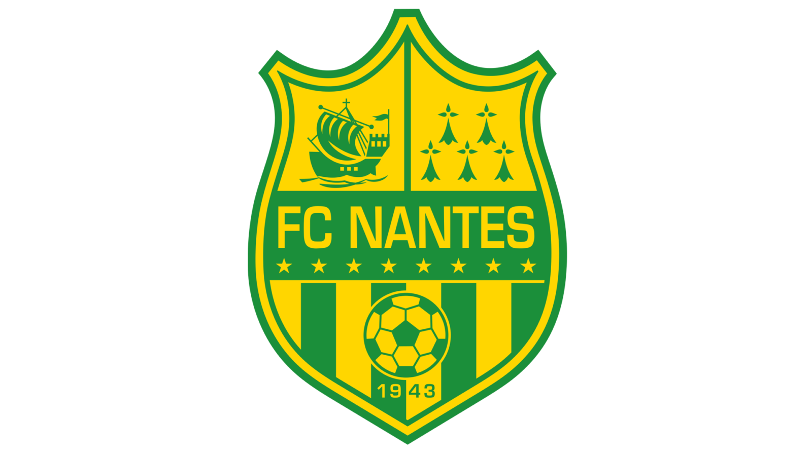
- It was a smooth and sleek crest with a yellow background, where the green clipper on the green wave with eight yellow stars was placed.
- C. Nantes Atlantique” was written in a classy and bold serif typeface in yellow, on the top green part of the crest.
- The stars were replaced from the wave to a white stripe above the clipper image and separated the graphical part of the logo from the wordmark, which now featured a strong and bold sans-serif font.
- The biggest part of the composition was placed on the bottom of the crest and featured a vertical stripes pattern with a green and yellow football and “1943” inscription under it.
- The “1943 — 2013” inscription was placed on the top part of the emblem, along the circular perimeter, and the gold ribbon with the “70 ans de Passion” lettering was placed under the emblem.
- 2019 — Today The visual identity design from 1019 is completely different from all the previous versions.
- The new logo is composed of a white or green shield with an enlarged stylized letter “N” on it, and a yellow club’s heraldic symbol on the bottom.
- The “FC Nantes” inscription is placed above the shield and executed in a strict and clean sans-serif typeface.





Leave a Review