Cure Bowl Logo
- Download PNG Cure Bowl Logo PNG Although the Cure Bowl logo has changed more than once during its comparatively short history, it has always featured the pink ribbon, an international symbol of breast cancer awareness.
- Not only the design but also the very name of the bowl emphasizes that it promotes awareness and research of breast cancer.
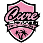
- Meaning and history 2015 – 2017 For the first game of the Cure Bowl, the logo was created in 2015 and stayed unchanged until 2017, although even after the redesign it remained more than recognizable, as not much was refined.
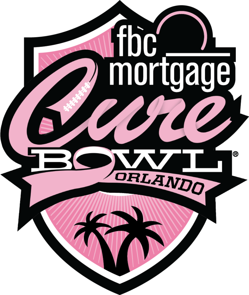
- It was a fancy pink and black crest with the sponsor’s, FBC Mortgage” lowercase logotype set on the top part.
- The body of the elegant crest featured a ray-like pattern in two shades of pink and stylized lettering in the center.
- The lettering was set in three levels — the bold and enlarged “Cure” in smooth cursive, written in pink and outlined in black, the white medium-weight “Bowl” in an extended serif font with the letter “O” stylized as the ribbon having its tails elongated, and the black uppercase “Orlando” written over the right tail of the pink ribbon, forming the “O”.
- Under the inscription there was a solid black image with two palms.
- 2017 – Today The first game took place in late 2015.
- Both the original logo and the ones that have followed are dominated by shades of pink with white and black nuances.
- The word “Cure” appears to be formed out of a pink ribbon.
- The same approach has been used for the “O” in the word “Bowl.” Another signature design element is the two palm trees below.




Leave a Review