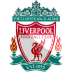
Liverpool logo and symbol, meaning, history, PNG
- According to the report, the flag featured “the letters L.F.A.
- Both Triton and Neptune were holding flags.
- There was a banner with the Latin text that can be translated as “God has granted us this ease.” 1892 – 1950 The very first Liverpool logo depicted the official crest of the city of Liverpool, the motherland of the team.
- It was a red and white composition with two Greek gods — Neptune and Triton, placed on the sides from a vertically oriented banner with the elegant and ornate images of two liver birds.
- 1950 – 1955 The redesign of 1950 introduced a simplified version of the Liverpool visual identity — it was just the Ted crest in a white outline with the white image of the liver bird on it.
- No ornaments, ribbons, and lettering here, just the main graphical symbol of the club, in their iconic color palette.
- 1955 – 1968 In 1955 the logo was redrawn again, and the crest shape of the Liverpool logo was replaced by a clean and neat vertically oriented oval.
- The color of the background was switched to white, and the red framing was balanced by the elegant red image of the liver bird and the “L.
- The new version featured a bold dark red silhouette of the bird placed on a white triangular crest with a thin red outline.
- The crest had two dark Ted ribbons placed along its bottom sides, and containing white “Liverpool” lettering in the uppercase.
- The “Football Club” inscription was set on a horizontal banner under the badge.
- 1992 – 1993 To celebrate the 100th anniversary of the club the new logo was I traduced in 1992 and stayed with the club for a year.
- The main crest featured the iconic liver bird image set under the red horizontal banner with “100 years” written on it, and the red “Liverpool Football Club” on the upper part.
- This badge stayed with the club for another six years.
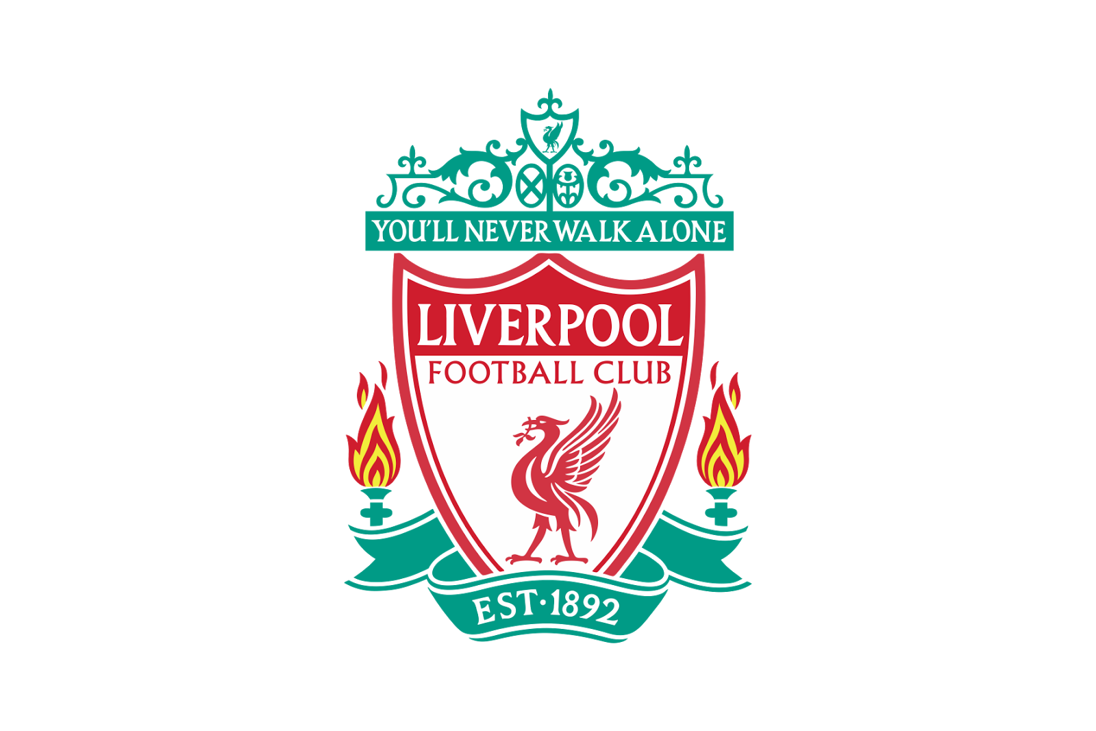
- 2012 – Today The redesign of 2012 brought back the Liverpool emblem from 1968, but in its modified version – the red liver bird’s contours were strengthened and cleaned, and the “L.
- The first date is the year when the club played its first game, while 2017 is the year of its 125th anniversary.
- There’s only the bird (and it looks almost exactly as on the primary logo, except that it’s flat) and the lettering “L.F.C.” (Liverpool Football Club).
- Similar to the primary logo, the anniversary version of the crest also includes the dates “1892” and “2017,” as well as the lettering “125 years” beneath.
- Color The current palette is based on not less than four bright and vivid, great for soccer colors, including Persian green (looking very much like #00A398), red (#D00027), and a vivid shade of yellow called Icterine (#FDF667).
- We should also point out, that as the Liverpool logo is a 3D one, in fact, there’re more colors.





Leave a Review