Zillow logo and symbol, meaning, history, PNG
- For instance, it provides data on how the value of the homes has been changing in the course of time.
- The advertising network Zillow launched in early 2011 in collaboration with Yahoo!
- is considered the largest one in the real estate business.
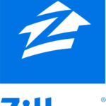
- The house design is put inside a blue square.
- It did its job, though, as it was perfectly legible and easy to reproduce.
- In the original version, the letter divided the house into two parts, the blue top and the green lower part.
- The combination of green and a grayish shade of blue was replaced by a bright blue tint.
- The type grew simpler (for instance, the “i” and the “l’s” lost their diagonal tops).
- Premier Agent symbol The Premier Agent badge is used by real estate agents to show they participate in the namesake program.
- The logo is based on a modified house icon from the regular Zillow logo.
- The letter “Z” is replaced by “P,” which “cuts” the number “1” out of the house.
- There was a “Premier Agent” banner, as well as the regular Zillow icon and the name of the database.
- Color The standard logotype is given in bright blue and white.
- The Premier Agent icon can be given in several versions featuring two shades of blue (a darker and a brighter one), green, black, and white.




Leave a Review