Young Boys logo and symbol, meaning, history, PNG
- Meaning and history Considering the interesting name of the Swiss football club, there is no surprise, that their logo is executed in a very bright color palette and doesn’t feature any traditional elements of the sports visual identity.
- It looks cool and modern.
- The logo, created in 1925 featured a circular badge with a double black and yellow outline, where the black part was wider and contained “Berner-Sportclub Young-Boys” lettering in yellow, placed around its perimeter.
- In the center of the badge, the modern “BSYB” monogram in massive serif letters was placed.
- 1957 — 1971 The central part of the logo remained almost untouched, but the framing was changed in 1957.
- Now the outline featured a darker shade of yellow and the lettering was executed in a light black sans-serif typeface.
- 1971 — 2002 In 1971 the team removes all the framing and extra details and starts using the black and yellow monogram on a white background as their official logo.
- 2002 — 2005 The oval crest appears on the Young Boys’ visual identity in 2002.
- Now the iconic monogram is placed on an ocular yellow and black background with the wordmark in black placed over two white arched banners on top and bottom of the crest.
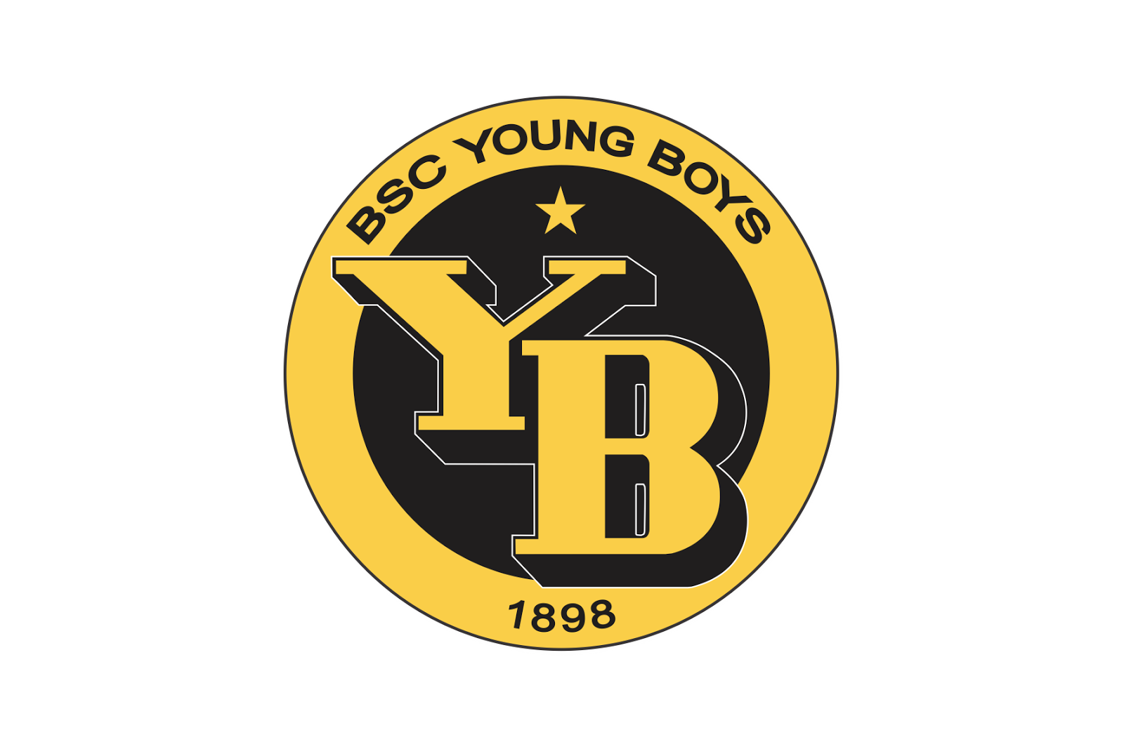
- 2005 — Today The rounded badge comes back to Young Boys in 2005.
- The monogram is now shortened to only two letters — “YB”, which are executed in dark yellow and placed on a black background.
- The yellow five-pointed star is located above the letters.
- The new symbol is enclosed in a circular yellow frame, where the “BSC Young Boys” inscription in black is arched along its upper part, and the “1898” date mark — on the bottom.
- Young Boys Colors YELLOW PANTONE: PMS 7548 C HEX: #F9CC11 RGB: (249, 204, 17) CMYK: (3, 18, 98, 0) BLACK PANTONE: PMS PROCESS BLACK C HEX: #000000 RGB: (0, 0, 0) CMYK: (70, 50, 50, 100) WHITE HEX: #FFFFFF RGB: (255, 255, 255) CMYK: (0, 0, 0, 0)




Leave a Review