WWE Monday Night Raw logo and symbol, meaning, history, PNG
- Meaning and history Though the visual identity of the program has undergone several major redesigns, all of the versions ever created for it looked brutal and powerful, and all of them used bright red color as its main.
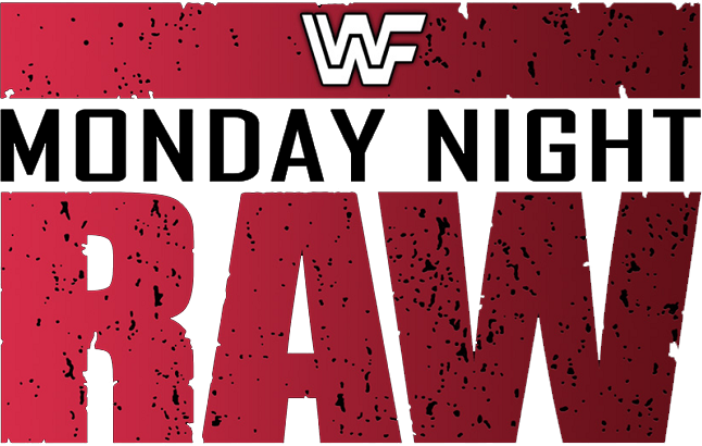
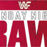
- 1993 – 1997 The initial logo for the wrestling show was introduced in 1993 when the program was launched under the name WWF Monday Night Raw.
- The logo was composed of a stylized enlarged “RAW” inscription with its letters’ contours slightly torn and the bodied colored red and black, the “Monday Night” lettering above it, executed in black sans-serif and set on a white background, and a rectangular banner on the top of the emblem, repeating the color and style of the “RAW” line.
- On the horizontally stretched red banner, there was a stylized “WWF” monogram, where one white “W” was placed on the other and both had their right bars stretched to the right, forming the letter “F”.
- 1997 – 2001 In 1997 the show was renamed WWF Raw is War, and the visual identity was refreshed.
- The new badge hosted a solid black square in an uneven white frame, with a stencil red “Raw” and “War” lettering separated by a white horizontal banner with the black “Is” on it.
- The new badge was composed of an extra-bold red “Raw” lettering enclosed intro a massive silver-gray frame, formed by straight armature lines.
- There was also a three-dimensional version of the emblem used by the show, and it was usually placed on a black background or a scene with fire on it.
- 2002 – 2006 In 2002 the logo was refined again.
- 2009 – 2012 The color palette of the logo was switched to red and black, keeping the silver outline of the massive Ted letters, but replacing the glossy three-dimensional metallic font with a gradient black one.
- There were also yellow sparkle details added to the outline of the logotype, making it look more dynamic and energetic.
- 2011 – 2012 In 2011 the “Super Show” underline banner in blue and white was added to the emblem, along with a stylized silver-gray WW monogram, placed above the “Raw” part of the logo.
- The new emblem was made three-dimensional, with the glossy gradient surface of the letters and a thin metallic outline.
- 2016 – 2019 In 2016 the WWE Monday Night Raw visual identity was completely redrawn.
- Its simplified badge now featured a bold geometric sans-serif “RAW” inscription with straight clean lines, underlined by a thick horizontally stretched rectangle.
- The red color of the emblem was darkened and gained some gradient shades, which added strength and brutality to the image.
- 2019 – Today The redesign of 2019 stretched the letters on the logo and turned an underlining rectangle into an arrowhead, pointing down.
- With the new geometry, the logo became unique and sharp, representing progress, strength, and fighting spirit.
- Font and color The “RAW” lettering from the wrestling program’s visual identity is executed in custom sans-serif typefaces where the massive letters are written with thick clean lines.
- A color scheme, that brilliantly reflects the essence of the show and the mood and character of its fighters.





Leave a Review