Wonder Woman logo and symbol, meaning, history, PNG
- Meaning and history The visual identity of a famous character has changed a lot since the introduction of its original version in 1941.
- 1941 – 1982 The very first emblem for Wonder Woman was created in 1941 and featured a very smooth and elegant badge in the art-deco style.
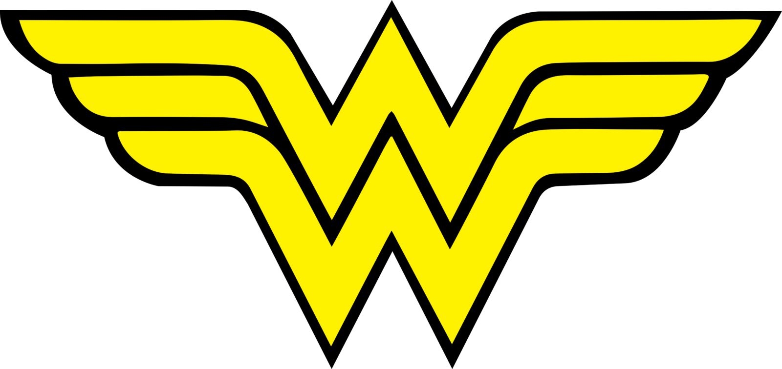
- A stylized emblem, composed of two letters “W”, placed one above another, with their bars elongated and spread to the sides.
- The badge was available in various color options, but the main palette was composed of black, white, and yellow.
- 2006 – Today The redesign of 2006 brought the original red and yellow color palette to the Wonder Woman visual identity, though the red in this version is darker and more intense.
- The new symbol looks powerful and modern, reflecting the character and its essence.
- 2011 – 2016 For five years, starting in 2011, there was another logo, used by the superhero.
- It was a light-gold badge in a black outline with sharpened angles and slightly arched lines of the wings.
- This emblem looked a bit more feminine, though still evokes a sense of strength and danger.
- 2016 – Today The logo introduced for Wonder Woman in 2016 is a three-dimensional badge with straight lines executed in the dark gold shade.
- The symbol repeats the composition of the previous versions, composed of two “W”s and a bird’s head, but in the new execution, it looks stricter and more powerful than ever.
- Font The distinctive letter “W” does not belong to any of the existing typefaces.
- It was created from scratch and tweaked quite a few times throughout the history of the heroine.
- Color The colors of the American flag have been the basic colors of the Wonder Woman’s costume, while her emblem in most cases has featured the gold color.


Leave a Review