Wheeling Nailers logo and symbol, meaning, history, PNG
- Download PNG Wheeling Nailers Logo PNG The franchise bearing the name of the Wheeling Nailers came to Wheeling, West Virginia, in 1992.
- The history of this ice hockey team started in 1981 in Winston-Salem and they used to have the name “Thunderbirds”.
- In 1996 they had to change it to “Nailers” because of the trademark dispute with the franchise from Seattle that had the same name.
- Meaning and history The new name was inspired by the city’s nail manufacturing heritage.
- All the team’s logos from this era feature cut nails in the form they were manufactured in the 1800s.
- It is usually referred to as a hockey mask, but actually it is the mask workers would wear while cutting nails.
- The mask is in two colors ‒ red and black, then gold and black.
- 1996 — 2003 Behind it there are two crossed nails.
- The 1996 and 2003 logos have a wordmark with the team’s name.
- 2003 — 2005 The redesign of 2003 was only about one color change on the logo.
- The mask and two crossed nails on the background were enlarged and got their contours cleaned, while the style and color palette of the logo remained completely the same as on the version of 2003.
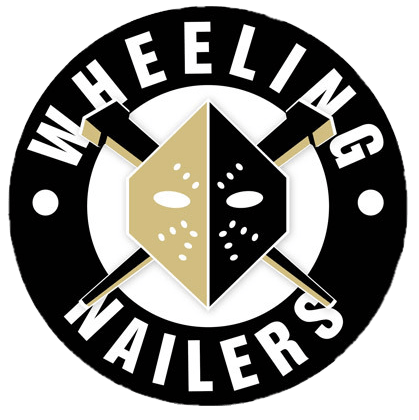
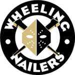
- 2015 — Today The 2015 logo is the same mask with cut nails behind it placed against the background of a circle.
- The outer circle is black with the words “Wheeling” on the top and “Nailers” at the bottom in white.
- The whole thing looks as if it has been “nailed”.





Leave a Review