West Ham United logo and symbol, meaning, history, PNG
- Download PNG West Ham United Logo PNG The history of the team goes back to the soccer club Thames Ironworks, which was established in the summer of 1895.
- 1923 — 1950 The first official logo for the club was designed in 1923 and depicted two crossed burgundy hammers enclosed in a circular frame and placed on a smooth curved crest in sky-blue.
- This unique color palette made the team’s logo stand out and stayed with them until the 1970s.
- The circle was removed from the club’s emblem and now the crossed hammers were placed on a light blue shield with a thin burgundy outline.
- The burgundy hammers on a white background enclosed in a burgundy shield frame are now placed inside a square with a light blue frame.
- The white shield was now outlined in burgundy and had an ornate image of the castle and two crossed hammers in the middle.
- Both the castle and the symbol of the hammer had only delicate burgundy contours, while the body left white.
- Under the shield, an arched white ribbon with a burgundy “West Ham United F.C.” inscription was placed.
- 1975 — 1980 In 1975 the crest was replaced by a solid burgundy circle with a white castle in it.
- Two thin and long hammers in the middle of the emblem featured an iconic sky-blue color.
- 1980 — 1983 The logo, created in 1968 comes back in 1980, but in a completely new color palette for West Ham United.
- Now the emblem features bright yellow and blue colors and looks vivid, energetic, and fun.
- It was the most laconic logo in the club’s history and only stayed official for two years.
- 1985 — 1987 The blue and yellow crest from 1980 is back again, for two more years.
- 1987 — 1999 In 1987 the color palette of the crest was changed to red and yellow, while the ribbon with the wordmark remained blue and yellow.
- 1999 — 2016 The original burgundy and light blue color palette are back, but now with yellow as the third main color.
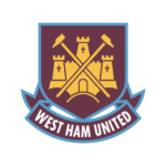
- The dark shield in a blue outline features a yellow castle and hammers on it and has a ribbon with white lettering under.
- The “West Ham United” inscription is executed in a bold and slightly narrowed sans-serif typeface, which looks professional and strong.
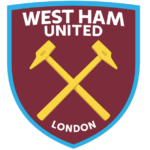
- The two yellowhammers are placed in the center of the crest, between two parts of the inscription: “West Ham United” on top, and “London” on the bottom.
- The team also started using its old logo from the 1920s as an alternative one, so the smooth blue shield with arched sides and two crossed burgundy hammers still can be seen on the player’s uniform.




Leave a Review