West Bromwich Albion logo and symbol, meaning, history, PNG
- Meaning and history 1969 — 1970s The West Bromwich Albion logo, created in 1969, featured an image of a throstle in a brown color palette, sitting on a brown branch with green leaves and red berries.
- There was no lettering or football symbolism on this version of the badge, although the bird, which will later be called Baggie Bird or Albi, will stay with the football club for all the following years, as its mascot and signifier.
- The whole composition with a branch, leaves, and berries, was now placed on a crease with a vertical blue and white stripes pattern.
- The new logo was EUR-catching and memorable.
- 1972 — 1973 For just a few months in 1972, the West Bromwich Albion Football Club has been using a very laconic and minimalist logo with the yellow bird contour set on a solid green background.
- The tiny Baggie Bird was set on the bottom line of the badge, almost invisible.
- B. Albion” inscription in the uppercase of a thin rounded sans-serif typeface was written.
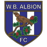
- The bird on the branch was kept in its original style, from the very first logo, and accompanied by the white “FC” lettering set under it, on a solid blue background.
- The monogram was usually executed in medium-blue color, which sometimes was accompanied by a thin black outline.
- 1986 — 1994 The redesign of 1985 introduced another long-lasting version of the WB Albion FC logo.
- The darkened and refined bird on a branch image from the first badge was now placed above the bold rounded “W.
- The elegant traditional ribbon in white and red was set under the crest and contained the uppercase “Labor Omnia Vincit” Latin motto, which can be translated into English as “Labor Conquers All”.
- 2000 — 2001 The blue and white striped crest comes back to the team’s primary logo in 2000.
- This is when the Baggie Bird is being redrawn in black and white, and the branch with the leaves gets more modern and stylized contours.
- No additional lettering, thin black framing, and traditional for the club elements and colors — that’s the recipe of a successful badge.
- 2001 — 2006 The redesign of 2001 lightened up the color palette of the WBA badge and replaced the black details with the blue ones.
- The contours of the bird and the leaves were redrawn more elegantly and ornately, and the vertical striped on the background got their shades pale and tender.
- 2006 — 2011 In 2006 the WBA badge was modernized and refined.
- Although all elements were kept, as well as the color palette, the contours were softened and emboldened.
- The “West Bromwich Albion” inscription was set in blue capitals of a medium-weight sans-serif typeface on a white background, on the top part of the crest, with above the vertical striped in blue and white.





Leave a Review