Watford logo and symbol, meaning, history, PNG
- Watford fans can now use bitcoin to purchase club merchandise, it has been announced.
- 1927 – 1950 One of the first Watford FC badges was created in 1927 and stayed with the club for almost two decades.
- It was a plain and modest crest in a monochrome color palette, with just three black letters “WFC” in a bold and rounded sans-serif typeface” placed on a white background of a traditional crest outlined in black.
- The simplicity and neatness of this badge made it suitable for almost any background and occasion.
- The animal was facing left.
- Another element was set under the inscription, it was a delicately contoured football executed in the same black and white color palette.
- 1958 – 1959 The color palette of the Watford FC visual identity was switched to blue and white in 1958.
- It was a contoured classy crest in white set on a blue background.
- With the white deer head, stylized monogram with the central “F” stretched vertically, and a fancy smooth ribbon with the complete “Watford” inscription in the uppercase, placed under the crest, also in white and on a blue background.
- The football image was removed from this logo version.
- The badge was normally placed on a dark yellow background, just the same shade as the outline and the lettering on the emblem.
- 1972 – 1974 The bee logo of the Watford Football Club was redesigned in 1972.
- 1974 – 1978 On the 1974 logo, an anthropomorphized hornet could be seen.
- The word “Watford” was placed above.
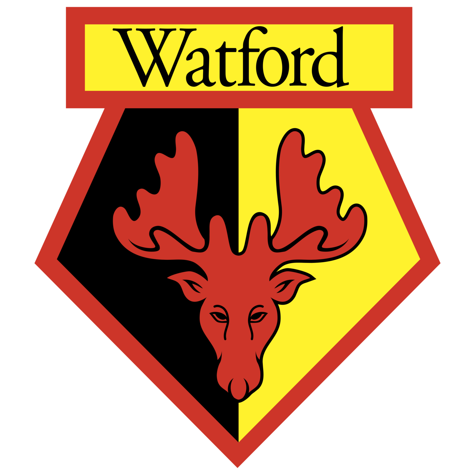
- 1979 – 1982 The colorful deer badge was redesigned in 1979.
- The “FC” lettering was gone from the badge, while the main “Watford” inscription changed its typeface to an elegant serif one, and was now set not in all caps but the Titlecase.
- The double black and yellow outline of the deer’s head was also gone, and the red mascot image got enlarged and started looking more powerful and dangerous now.
- 1982 – 2001 The redesign of 1982 refined all of the Watford visual identity elements and drew them in a more professional and modern way, with clean and strong contours.
- The iconic red yellow and black badge with the deer image was placed on a bright yellow square and enclosed into massive green wrath with the “1991 — 92” datemark placed on top of it, right above the rectangular banner with the logotype.
- 2006 – 2007 Colors The current color scheme of both the Watford logo and uniform includes three colors: black, yellow, and red.






Leave a Review