VfB Stuttgart Logo and symbol, meaning, history, PNG
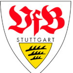
- Download PNG VfB Stuttgart Logo PNG The full name of the sports club commonly known as VfB Stuttgart is Verein für Bewegungsspiele Stuttgart 1893 e. V. While the VfB Stuttgart logo has gone through around ten modifications, it has always preserved the shield shape.
- Also, the stylized antlers and the lettering “VfB” could be seen on the logo for most of its history.
- The original logo was a simplified shield with a rounded lower part and a crown above.
- The shape of the shield grew more complicated.
- Inside the gold shield, there were three black antlers.
- 1950 — 1963 The gold shield with the black antlers grew smaller.
- It was placed inside a larger red shield and occupied its lower part.
- The name of the club and the year were colored red, to stand out over the white background.
- 1984 — 1994 The year, when the club was founded, disappeared from the VfB Stuttgart logo leaving it cleaner and less cluttered (if it was possible at all for a design using an old Germanic script).
- 1994 — 1998 The designers slightly simplified the lettering.
- And yet, the shape of the letters grew more minimalist, and at least you could see that they were real letters, not just an abstract image.
- The year returned but looked smaller now.
- Not only the year returned but even the gold star from the original 1893 logo.
- Color The combination of black and gold, the colors of Stuttgart and the state of Baden-Württemberg, has been used to establish the link with the location where the sports club is based.






Leave a Review