Vegas Golden Knights logo and symbol, meaning, history, PNG
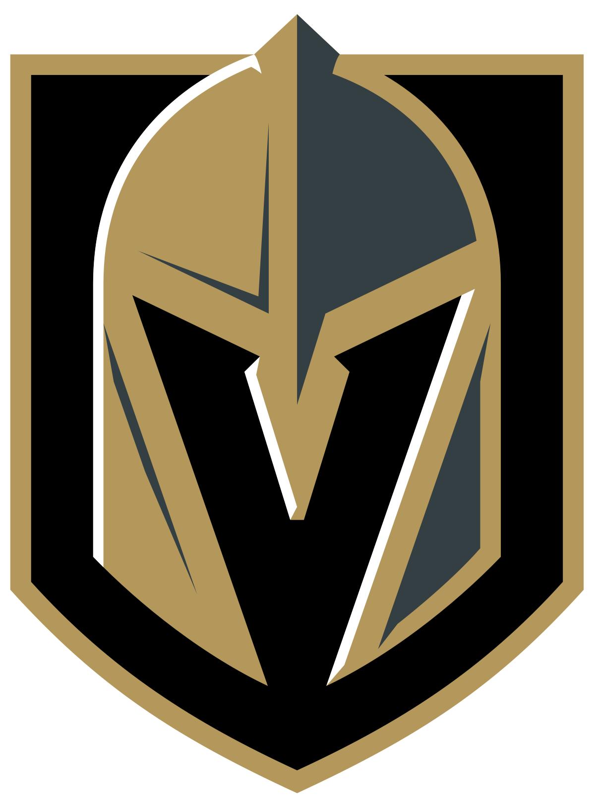
- Download PNG Vegas Golden Knights Logo PNG Being very young, the ice hockey team Las Vegas Golden Knights has had only one primary logo so far.
- While focusing on the knight theme with such long-time symbols as a shield and a helmet, the emblem also pays tribute to Las Vegas.
- The following year, the NHL started to take bids on expansion teams officially.
- The bid for a Las Vegas team submitted by businessman Bill Foley and the Maloof family was approved in the summer of 2016, while the first player, Reid Duke, was signed in March 2017.
- 2016 – 2017 The team introduced its first logo in 2016, five months before the final version was unveiled in advance of the 2017/18 playing season.
- While being quite simple, the temporary logo still did have mood and style.
- 2017 – Today The 2017 symbol The name was chosen due to its noble symbolism.
- As Bill Foley, the majority owner, pointed out, “knights are the elite warrior class.” The knight helmet, which is the visual center of the Vegas Golden Knights logo, is grey and gold with black and white highlights.
- It is placed in a black shield with a golden outline.
- Another important detail is the letter “V” seen in the negative space, which stands for Las Vegas.
- Alternative emblem The secondary logo further elaborates on the knight team, this time focusing on another popular knight symbol, a sword.
- The insignia has been probably drawn by hand rather than just made up out of an existing type.
- The glyphs seem to fit the brand identity very well as they look a bit like neon signs burning brightly in the night.
- Color While the official palette includes four colors (steel grey, gold, red, and black), only three of them can be seen on the primary Las Vegas Golden Knights logo – all, except red.






Leave a Review