Contents
United Hockey League (UHL) logo and symbol, meaning, history, PNG
- Download PNG United Hockey League Logo PNG While the history of the United Hockey League lasted around twenty years, it was renamed two times and spent only a decade under the name “United Hockey League.” Meaning and history 1991 — 1997 The original badge for the United Hockey League was created in 1991 when the name of the league slightly differed.
- It was a crest of a traditional shape, with a medium-thick black outline and emboldened bottom part, where the white wordmark in two levels was set.
- As for the main part of the crest, it featured a white background, where two flags, American and Canadian were drawn in straight lines, crossed.
- The handles of the flags and six five-pointed stars around them were executed in lime-green.
- Overlapping the drawing, a vertically oriented “CHL” abbreviation in black was written on the crest, ending up with a hockey puck.
- As for the inscription on the bottom part of the logo, it said “Colonial Hockey League” and had its upper level in a bold serif typeface, while the bottom one — in a medium-weight serif font.
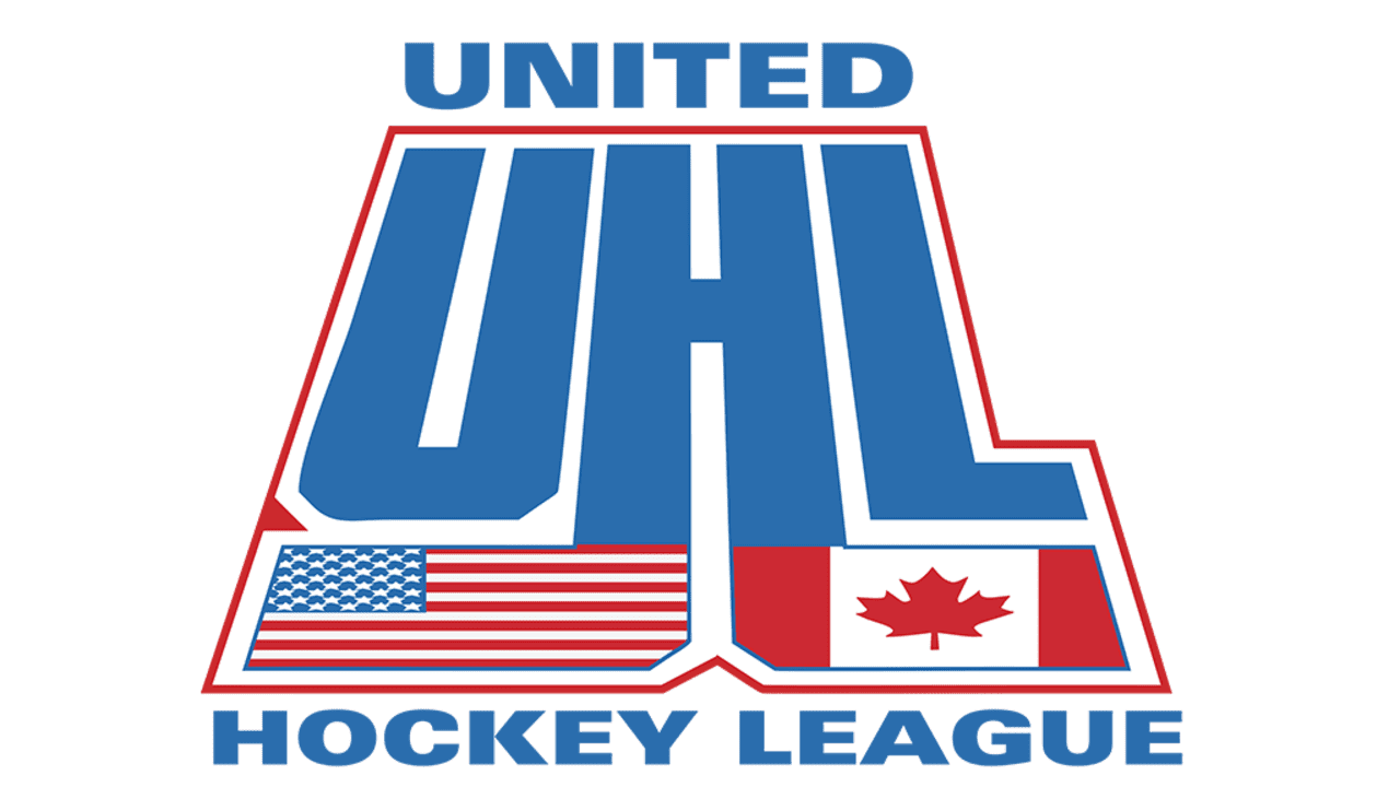
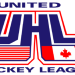
- 1997 — 2005 The earliest United Hockey League logo (1997) featured the letters “UHL” sloped backward with the US and Canadian flags below.
- The name of the league was given in two lines (above and below the main emblem).
- 2005 — 2007 In 2005, another UHL logo was unveiled.
- While the flags were gone, the emblem still preserved some of their symbolism in the color palette and pictorial elements (the stars and stripes, for instance).





Leave a Review